
Scope Security
Creating an effective security solution that’s custom-built for healthcare teams
My Role: UI/UX Designer, UX Researcher
Client: Scope Security
Team: Austin Price (Creative Director), Austin Carr (Engineer), Garrett Vangilder (Engineer), Bina Farooque (Project Manager)
Tools: Figma
Introduction
Scope Security was created as a healthcare-focused security company that believed the traditional cybersecurity industry was not meeting the needs of healthcare organizations due the specific & expansive nature of internet-connected devices that are responsible for numerous patient lives.
With a desire to create a better way to secure confidential patient data, their solution was to create a digital product that would be easily accessible and could serve large teams and hospitals.
The Problem
How do we design a healthcare-focused security application that will detect attacker behavior and provide actionable recommendations for stopping the attack before significant damage is done?
Team & Role
I worked directly with a lead designer with occasional support from internal developers. I was involved in all phases of the design process including: information architecture, interaction design, visual design and prototyping. I also conducted user research using interviews and usability testing in order to address user behavior and gather feedback from design choices.
The Research
User Interviews:
In order to identify what the target users would need out of a healthcare security product, 7 interviews were set up with CISOs and CIOs from various hospitals that would provide us more insight into what software they currently use, what problems they faced, and how this product could be potentially used in their respective organizations.
Key Takeaways:
1. Users need an easily digestible dashboard that displays all the relevant security data they need to assess and monitor the hospital’s security
2. Users need a way to see what detected threats need their immediate attention and what items can wait
3. Users need a way to manage the security permissions for their team
Personas:
By conducting the 1:1 user interviews, I was able to establish 2 key characters who would be involved in the day to day experience of using Scope’s healthcare security web app.
This helps create realistic representations of our key audience for reference and keeps the user’s goals & needs at the top of our team’s minds.
Information Architecture
Task flow:
Onboarding screens
During our roadmapping session with the client, we had identified the key specs that had to be included in the app in order to build the MVP. With our target users’ feature requests identified now as well, we were now ready to see how we could incorporate these features into the key specs.
We created a task flow that mapped how a user would use the web app, and divided the flow into 3 sections:
1. Process of onboarding a new user
2. How the user can interact with the dashboard once logged in
3. How a user can manage their administrator permissions for their team
Dashboard Wireframe:
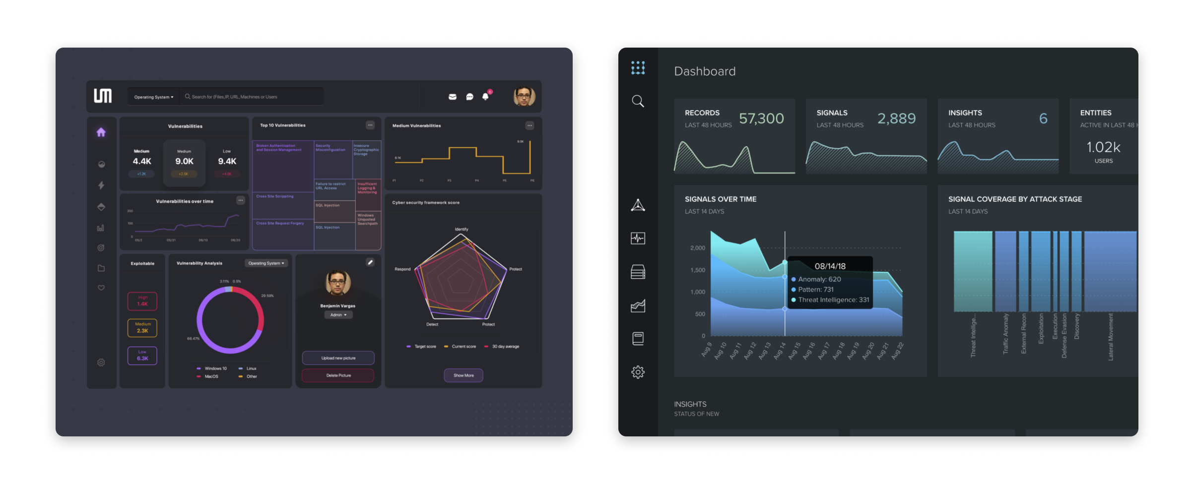
Dashboard Visual Design
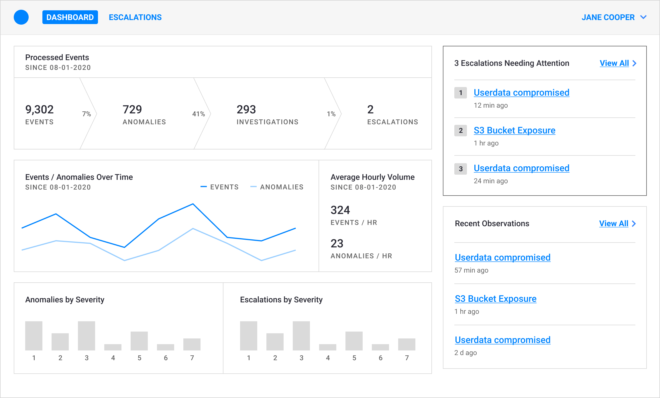
Since all of the users we interviewed mentioned the importance of a clean and easy-to-understand dashboard for seeing all their data at once, I dedicated some time for exploring various data visualization designs. The dashboard would be the first thing users saw when logging into their accounts and needed to be designed in a way to showcase data effectively. After Austin created the dashboard wireframe, I took the reins on the visual dashboard design, conducting a deep dive into existing data visualization designs and spent some time sketching out and exploring different graph design possibilities with these goals in mind:
The dashboard needed to:
Stand out from other security dashboards
Appeal to technical users
Clearly show what items need attention
Inspiration Board:
“A beautiful chart that no one can read is just abstract art.”
Based on previous user interviews, I knew what the dashboard shouldn’t look like. However, it was more difficult figuring out what an ideal healthcare security dashboard should look like. I spent a good amount of time looking through existing security dashboards like Splunk and dashboard designs on Dribbble.
With Splunk, I liked how important numbers were displayed in large text to immediately capture the user’s attention and the different data sections were divided neatly. On Dribbble, I took note on the variety of creative ways designers showcased data in visually-pleasing graphs and charts.
Data Viz Explorations:
I followed this design process for creating the data visualizations:
1. Researching different data sets, graphs, and charts
2. Creating explorations for the 6 different data sets
3. Gathering feedback for my designs internally & externally
4. Iterating on the data visualization items
For a more in-depth look at my data visualization process, please follow this link: View Data Visualization Process
Interaction Design
After the dashboard design was approved both internally and by the client, I created a high-fidelity interaction prototype to show other features of the product and gather feedback. For the purposes of this case study, I will focus on 3 features.
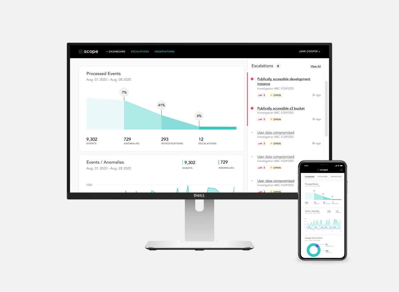
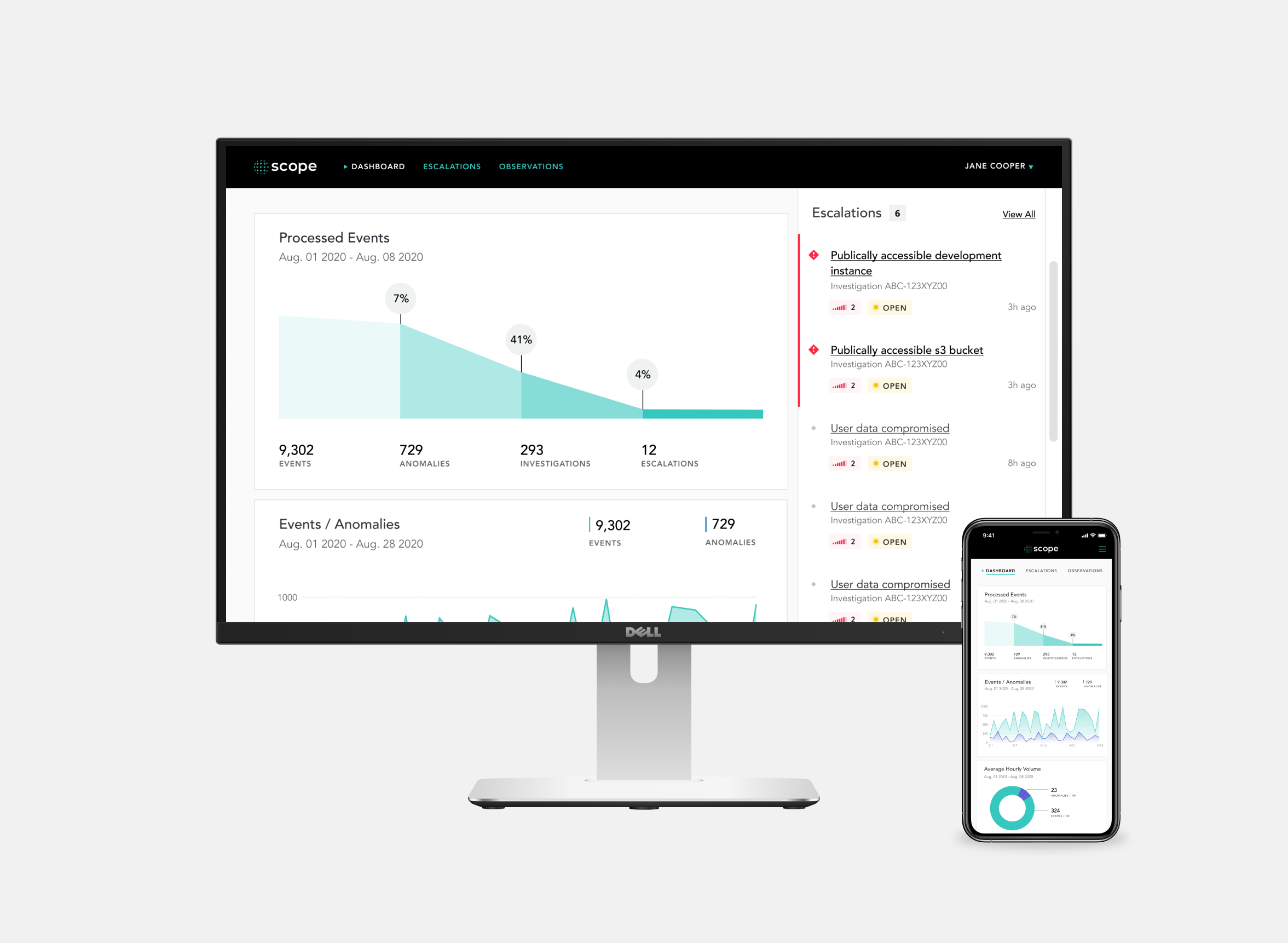
Dashboard with Escalations Sidebar:
The “Escalations” sidebar on the dashboard allows users to see items that need immediate attention - the user is able to click the text links to see a particular item in more detail and click the “Acknowledge” button to let other members of their team know that they have physically seen this issue. They can also click the “View All” text link to see all of the escalations in a table format, where they can use a filter to narrow down their search for particular items.
Escalations Page Filter:
In situations where the user needs to find particular items quickly, they are able to use the filter feature in the escalations page. They can use the search bar, check the “Needs Attention” box, choose the severity levels, choose the status, and pick a date range.
Organization Settings:
When a user needs to manage other users or notification endpoints, they can access the organization settings page by clicking on their name from the dashboard to access a dropdown menu that gives them the option of managing their user profile settings, managing their organization settings, or logging out of the product.
Here, the user is able to add, edit, or delete notification endpoints. While not shown in the above video, the interaction design of managing other users is exactly the same as managing the notification endpoints.
To view the entire prototype from user login to organization settings management, please click here: View Entire Prototype
Outcome
The high-fidelity interaction prototype went through several rounds of both internal and external feedback before being approved for developer hand-off. While the app was generally well-received within the company, there were still 3 areas that needed updating after performing usability testing:
1. Addition of an empty state dashboard
2. Adding the ability to collapse and expand the “Closed Escalations” items
3. Redesigning the severity level markers
After updating these features, I worked in parallel with the engineering team to build the components that would exist on the app. One thing that I wished went differently for this project would be obtaining realistic copy for all the screens before developer hand-off. While we did ask the client to provide the copy before this stage, it did not happen so we just went with filler text.
Overall, this was a great complex project for me to work on, allowing me have a huge part in shaping the visual design of the product and providing me with the experience of working with data visualization models.