
Kosherkart
Improving the e-commerce experience for an online grocery store
My Role: UI/UX Designer, Illustrator
Client: Kosherkart
Team: Austin Price (Creative Director)
Tools: Figma, Shopify, PageFly
Introduction
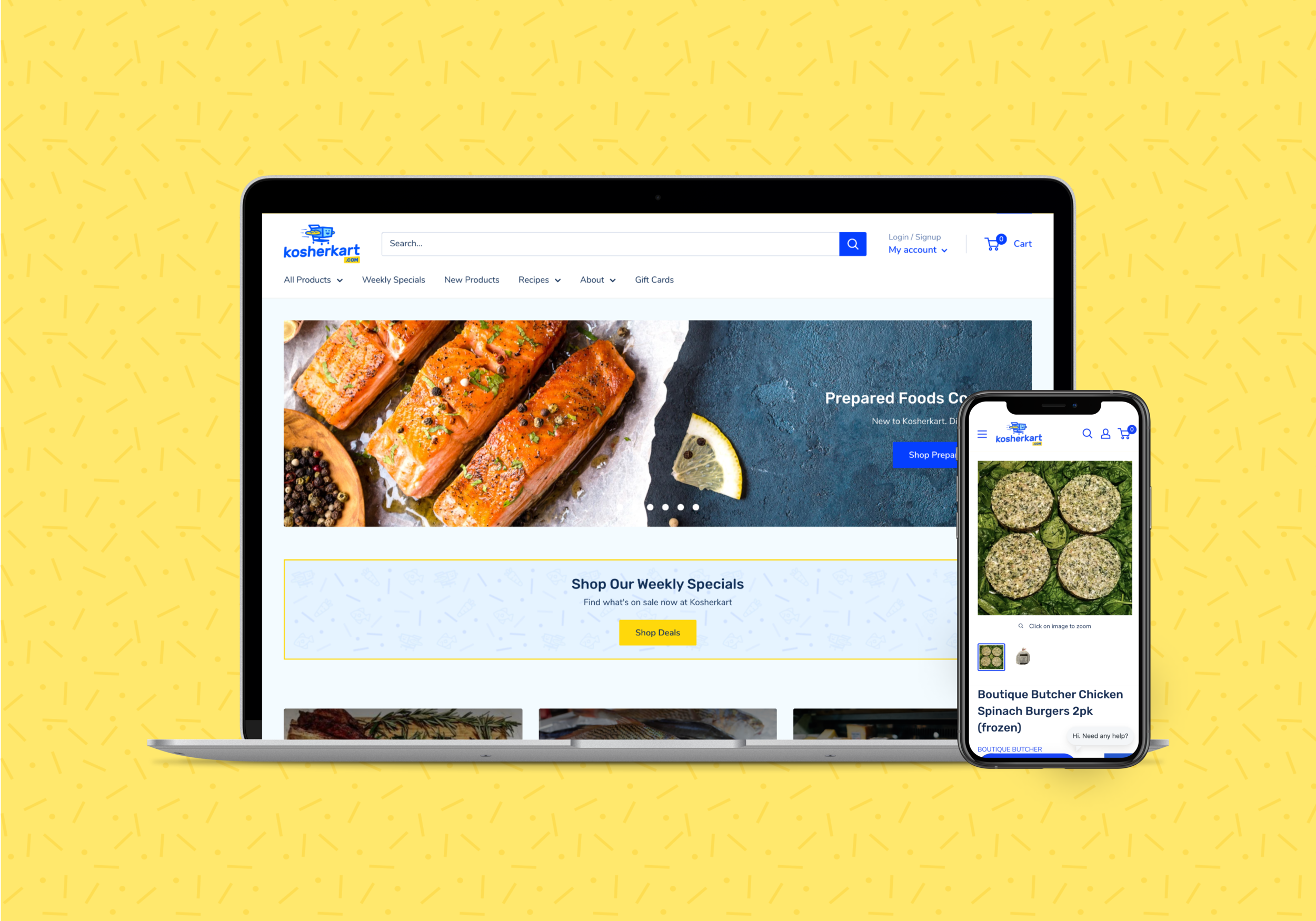
Kosherkart is an online kosher supermarket with a Shopify e-commerce platform that serves the New York City and surrounding areas.
Like many grocery delivery companies during the pandemic, Kosherkart saw an uptick in their sales as customers preferred to shop online for their groceries rather than in-store. While the site received more customers, the customer support team started receiving emails from new and current shoppers about how the site was difficult to use.
Problems
Speaking with Kosherkart customers, we were able to identify 4 primary problems with the existing website. The problem areas are outlined in red below:
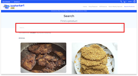
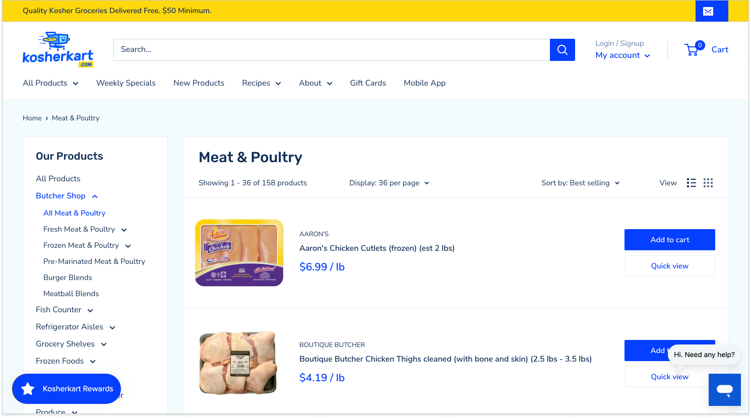
1. Search difficulty
Customers had a hard time looking for products they were interested in. When they looked up a product such as “chicken”, they just saw results for chicken recipes and had to scroll down to see actual chicken products. In addition, some customers mentioned they had a hard time seeing the actual search bar as the “search” text was light grey and there was no button visible.
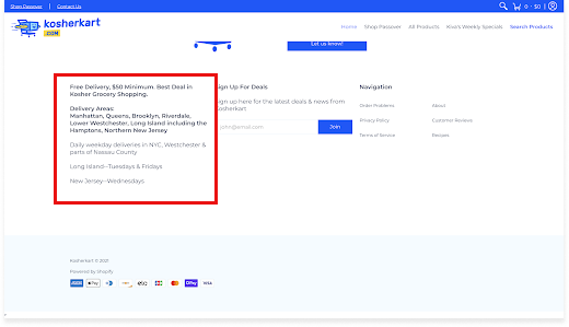
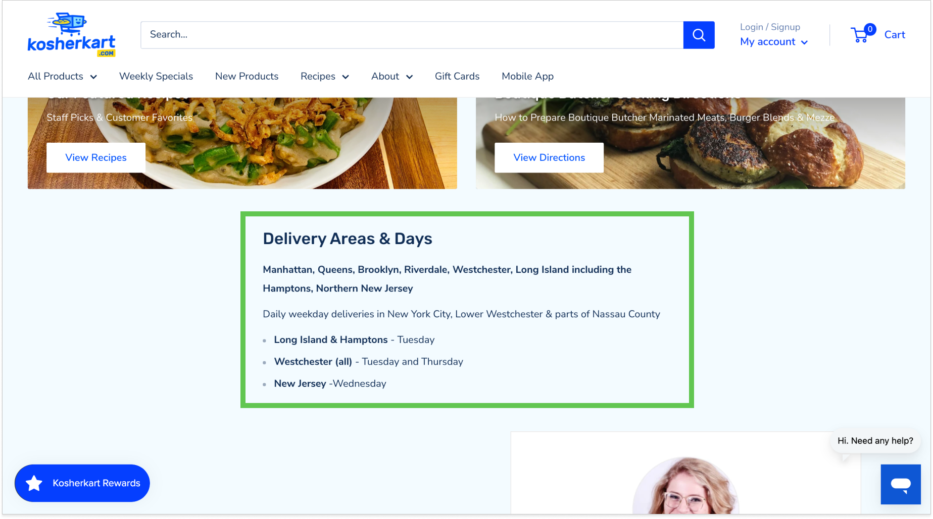
2. Delivery area confusion
Delivery area info is hidden and user must scroll down the page to see it. When checking out, the user should see this information and not only find out after they type in their zip code that they don’t live in the delivery area.
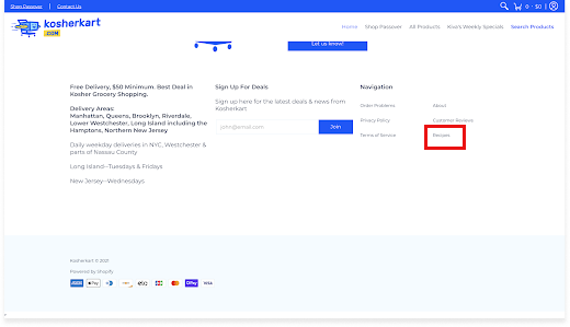
3. Hidden recipes section
Recipes link are only found in footer and select product descriptions. How can a user find a recipe they have seen on an item description again if they exit the product item page? Their only option is to find the recipes text link in the footer.
4. Dated visuals
Customers unanimously agreed that the website looked visually dated and the graphics were unappealing when compared to more modern grocery websites such as Whole Foods and other competitors.
Opportunity
How might we make the Kosherkart website easy to navigate, modern, and competitive?
By identifying the key problems through customer feedback, we were able to turn these problems into opportunities to solve for in our redesign of the website.
New website needs a better navigation structure which users can rely on to find what they’re looking for quickly
Redesign should make key features such as recipes and delivery areas easy to find
The user interface of the website needs to be refreshed with modern visuals and use a more appealing Shopify theme
Reworking Kosherkart’s content organization
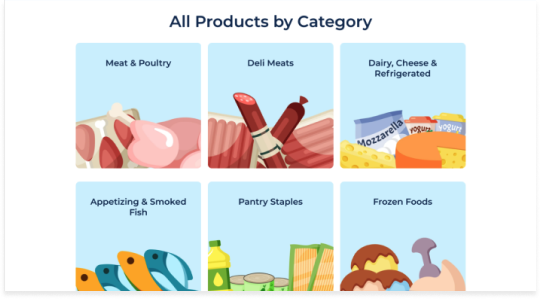
The old website had a navigation menu with an “All Products” link that displayed products in 4 categories:
1) Meat & Poultry 2) Deli Meats 3) Dairy, Cheese & Refrigerated and 4) Appetizing & Smoked Fish
Each of these 4 categories had about 20 items listed underneath, which made the expanded menu overwhelming large and difficult to search for an individual item. In addition, the founder was about to bring in a new fish vendor, and these new raw fish products would not fit underneath any of the existing categories. Simply put, the entire navigation menu needed to be reworked.
I met with Kosherkart’s founder to discuss how we could improve the product menu - rather than trying to fit all products under 4 categories, we could add 5 more categories which would make the expanded menus for each of the text links smaller. We also discussed new homepage features that could be helpful to customers, such as moving the “Weekly Specials” to the top of the page and adding a recipes & cooking directions section, as well as a customer testimonials section.
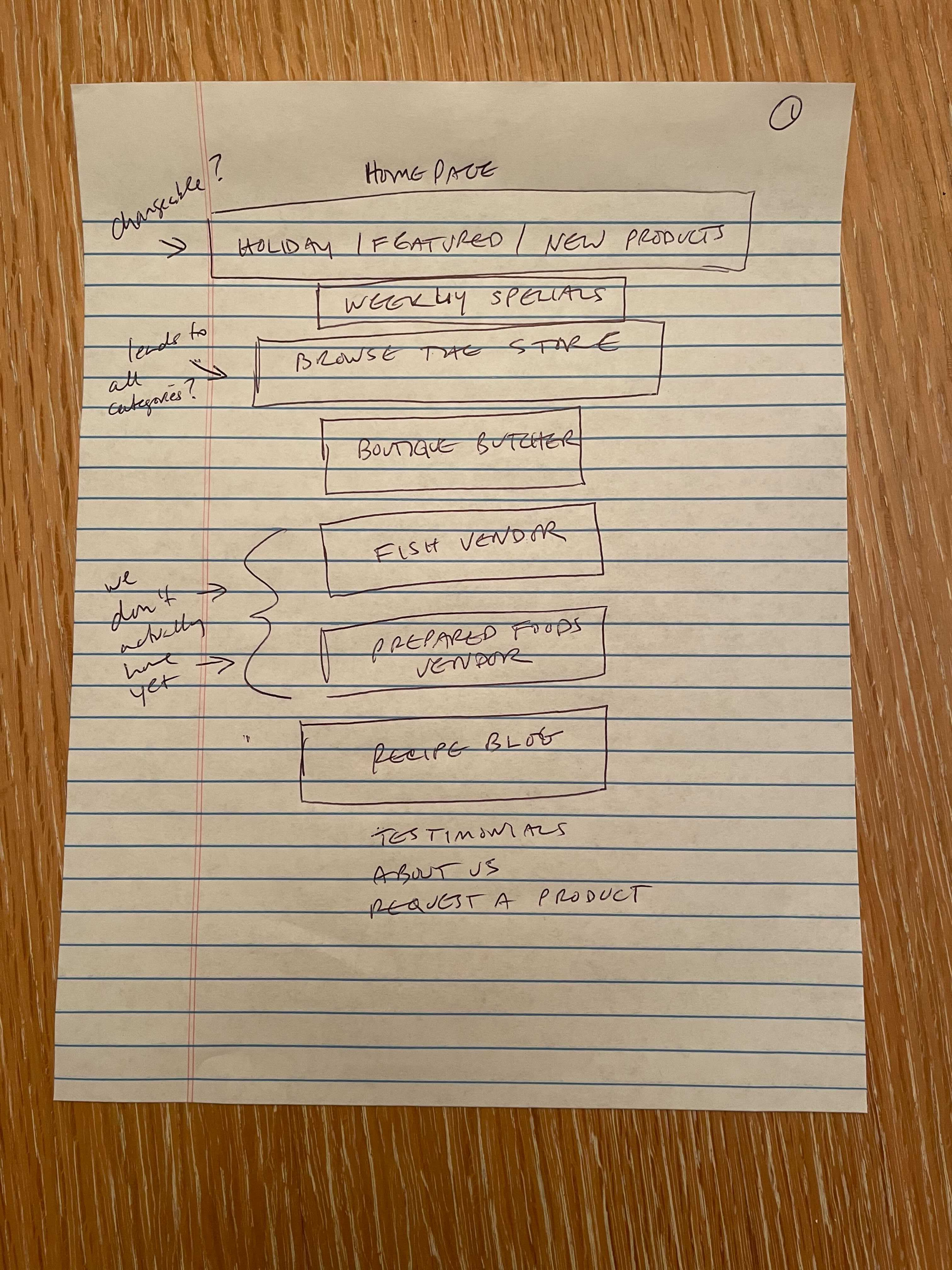
Navigation structure - click on image to enlarge
After confirming what menu items the client wanted to show in the new website, I created a navigation structure that would help me group the different pages together and figure out which subpage links would go under the navigational elements.
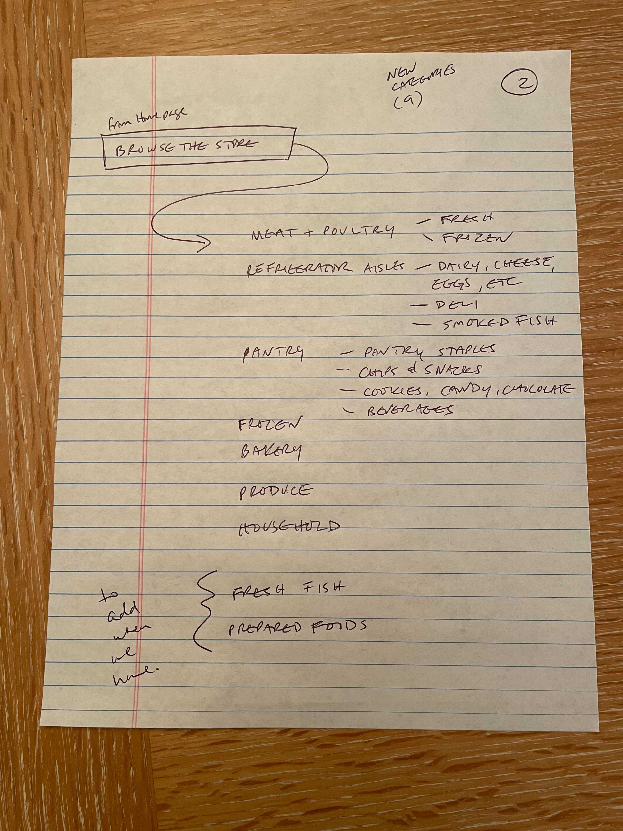
Sitemap - click on image to enlarge
To show what information would be displayed on each new page, I created a sitemap which helped with organizing and sorting the new content. There would now be 3 new items on the homepage - Recipes, Cooking Directions, and Customer Testimonials. The “Weekly Specials” section would still be shown on the homepage, but its placement would now be moved to the top of the page.
Finding the right Shopify theme
A major constraint of this project revolved around the backbone of the current website - since the company uses Shopify as their platform, the new website design needed to use an existing Shopify theme. The old theme used was a template called “Avenue” - it was a decent fit for the Kosherkart website, but the main drawback with Avenue was it’s navigation structure - we weren’t able to customize it the way we wanted to, which was removing the 4 main categories and their respective list items when expanded. What we wanted was a navigation bar that would show individual text links and their subpages without crowding the entire top portion of the homepage.
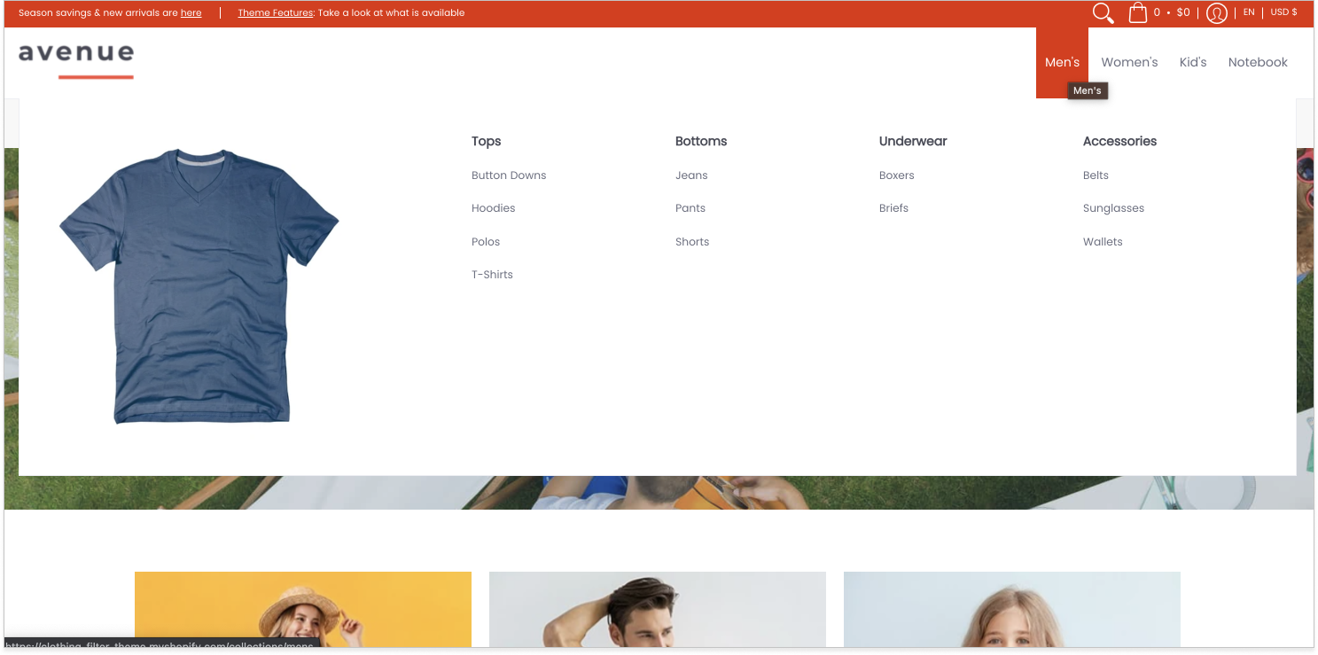
Avenue’s navigation menu
Another drawback of the Avenue theme was that it wasn’t very flexible and didn’t offer enough section templates that we could work with, such as a template that we could customize for adding a Customer Testimonial and Recipes section. We could technically add custom HTML to create these features, but because that would draw out the timeline, we decided that switching to a new template would be the most efficient option.
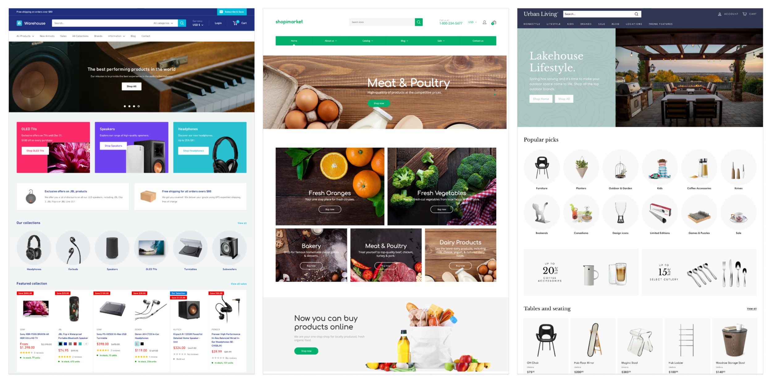
From left to right: Warehouse, Shopimarket, and Expanse themes
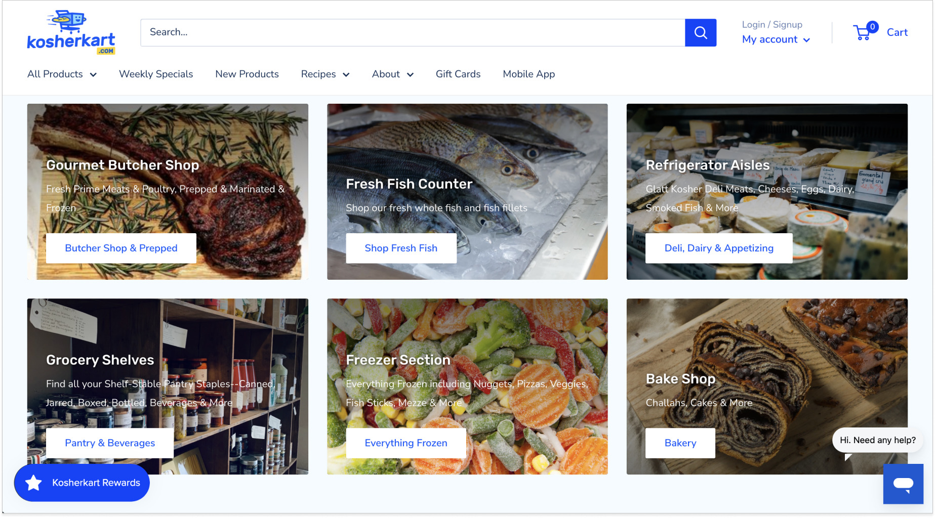
While looking for potential new Shopify themes to use, I was drawn to 3 themes in particular: Warehouse, Shopimarket, and Expanse due to their clean user interfaces and flexibility for customization. However, out of these 3 templates, I felt that Warehouse would work best due to their customizable navigation menu and organized collections page. The layout of this page would help customers find products quickly as it sorted the items in an organized manner and was easy to locate as it lived in the left side panel of the page.
Kosherkart’s collection page
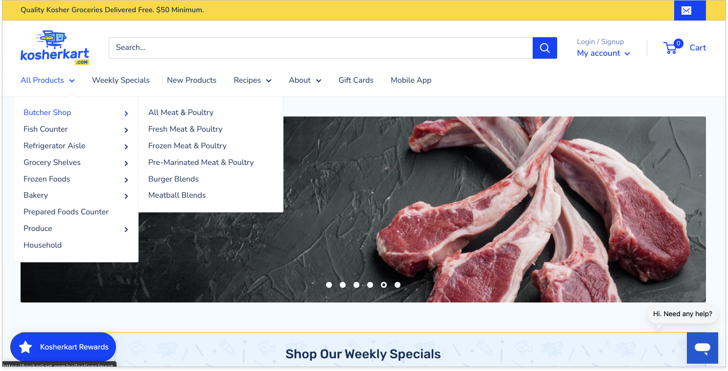
Kosherkart’s new navigation menu
I applied the Warehouse theme to the website to see how it would look, adding the company’s logo and customizing the top portion of the homepage. I was able to customize the navigation menu, sorting the products into 9 categories and successfully created an expanded menu that did not take up the entire top portion of the page like before.
With the navigation nailed down, I moved on to improving the other 4 areas that we revealed previously with customer research.
Search bar
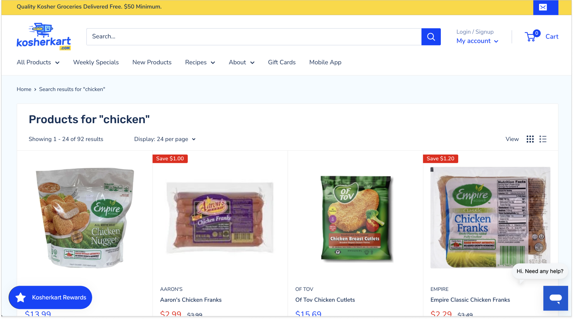
Customer problem: I don’t know how to search for items since there is no search button. Also, how come when I search for an item like “chicken”, I see recipes come up first? I need a way to quickly find what I am looking for.
Our solution: Add a search button next to the search bar and remove recipe ietms from coming up during search results.
Delivery area
Customer problem: How do I know if you deliver to my address?
Our solution: Specify the areas and days Kosherkart delivers and move this information from the footer to higher up on the homepage.
Recipes
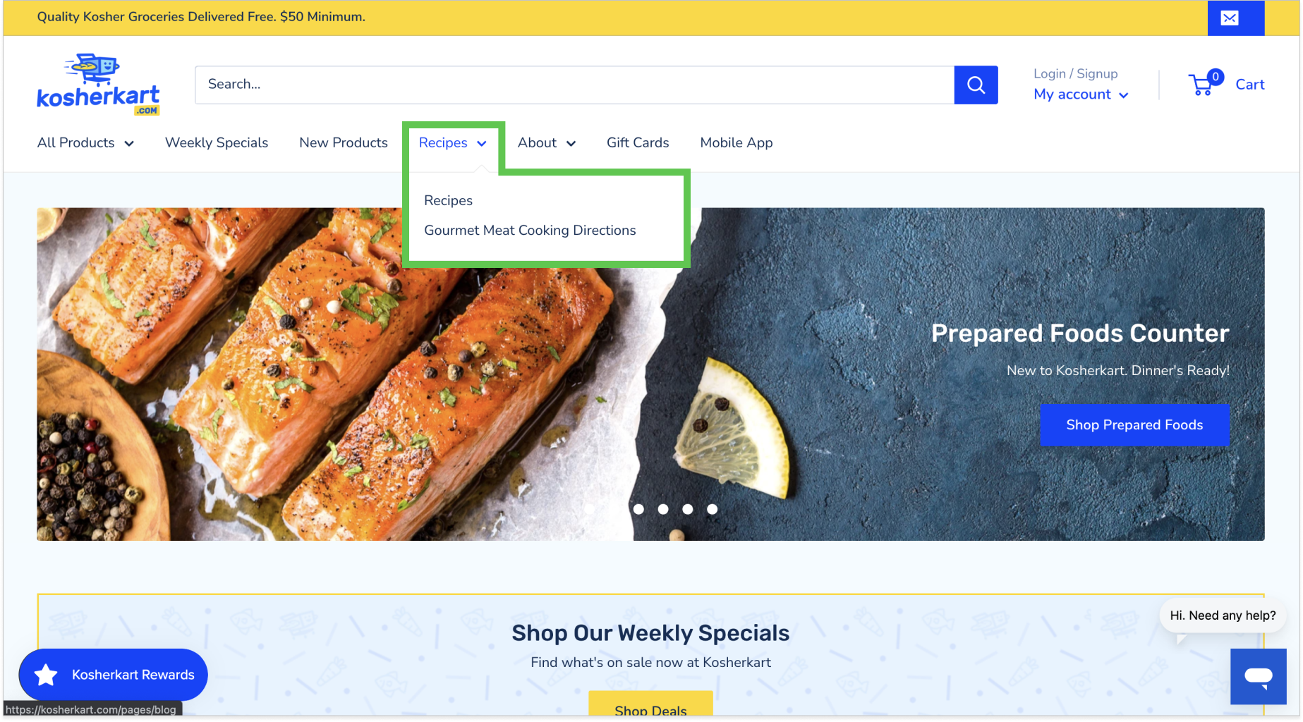
Customer problem: I remember seeing a recipe I wanted to try out, but now I can’t find it anymore. How do I know how to cook the gourmet chicken burgers I just purchased?
Our solution: Add a “Recipes” text link on the navigation menu so customers can find recipes and meat cooking directions easily.
Visuals
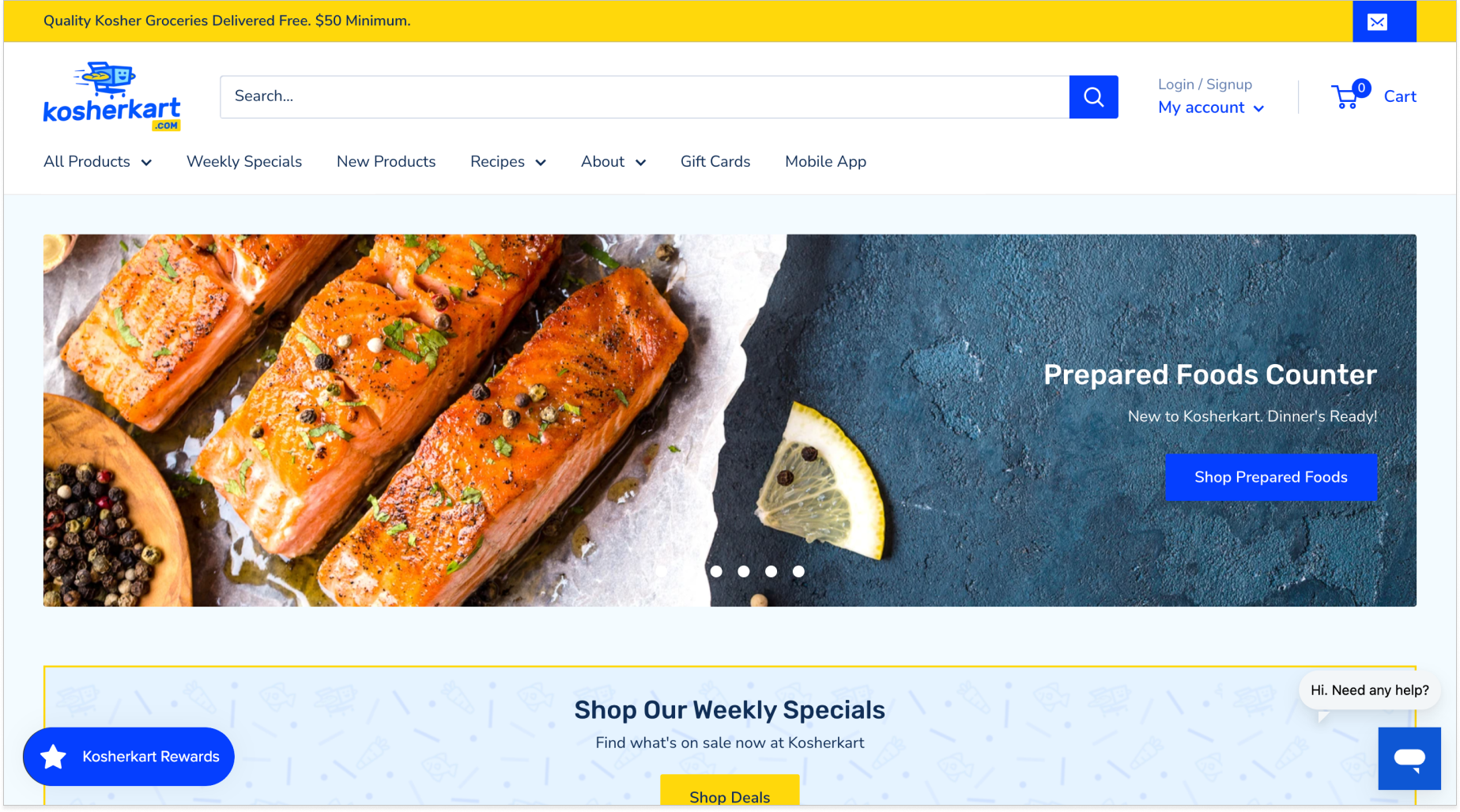
Customer problem: Your website’s graphics look dated and are unappealing to me.
Our solution: Remove previous graphics and replace them with professional-looking food photos.
Outcome
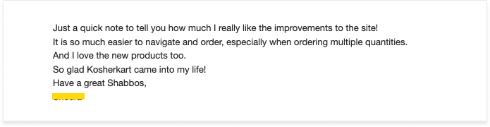
The website refresh proved to be a success! The Kosherkart customers noticed the improved features and the client forwarded the feedback to our team! With this newfound success, Kosherkart was ready to buy their own company van, and I was assigned the task of creating a van wrap for them. While this was my first time creating such a feature, I was super excited to be able to create a design that existed in the physical space.
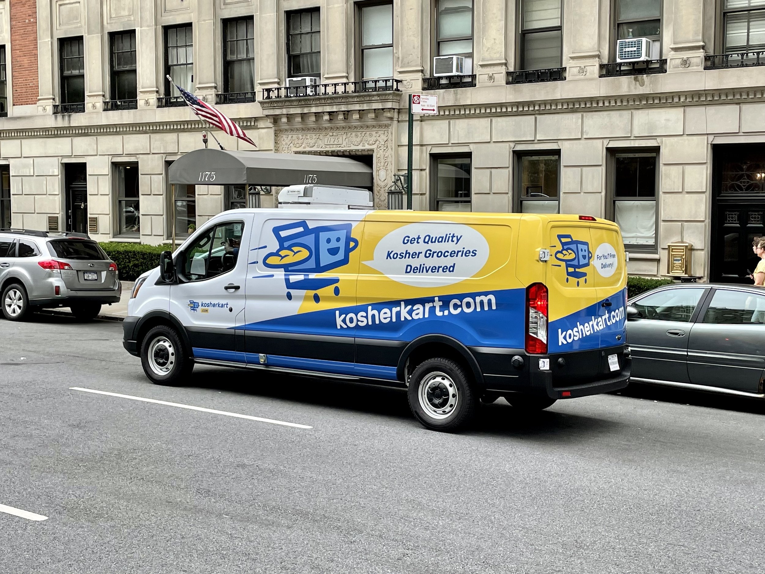
Spotted — A Kosherkart van in NYC!