
Momentum Planner
Visual identity, interaction design and mobile design for a productivity app

My Role: UI & Interaction Designer
Client: Productive Flourishing
Team: Austin Price (Creative Director), Nathan Nash (UX Researcher), Michael Prather (Engineer), Jen Dooley (Engineer), Bina Farooque (Project Manager)
Tools: Figma
What is Momentum Planner?
Momentum Planner is a personal planner product owned by Productive Flourishing, a company that helps creators, business owners, and leaders streamline their workflow to finish projects and achieve goals. The planner allows customers to keep their goals, projects, and schedules into one place.
The problem
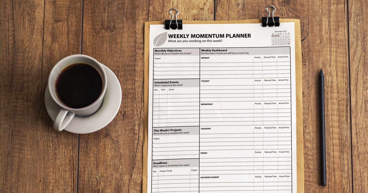
While the Momentum Planner was a favorite among their customers, the planner existed only in physical or PDF form. Customers had 2 choices: they could either buy a hard copy of the planner, or buy the PDF version and download the pages themselves to print out. Over the years, with the world becoming more digitized, customers started asking the company for an application version of the planner - one that was more portable and didn’t require them to print out any pages.
With more than 1 million downloads to date, the planner was a widely used product that many customers were already familiar with. How do we capture the functionality of this physical planner and convert it successfully to an app? With so many productivity apps already out there, how can we design the app to engage both current customers and new ones?
Users & audience
The target users of the planner consist of authors, small-business owners and leaders. Most work in the creative industry, and while their ages range from late 20s to early 50s, most are generally familiar with mobile apps as they use them daily for a variety of tasks and pleasure. They show a strong preference for mobile apps over paper planners as they need a product they can access anywhere at anytime.
A key differentiator that makes the planner stand out from other competitors is that the founder and CEO, Charlie, also offers a planning e-Course that customers can enroll in to access 15 lessons that teaches users core principles of the psychology behind productivity. The users who enroll in the e-Course are able to use the planner as a supportive tool in their planning journey.
The process
In order to identify what features the product needed to include, our design started out by conducting user interviews with 5 current Momentum Planner customers in order to understand their behavior patterns and feature requests. After analyzing the user findings, we were able to identify the key features that the app needed to include:
1. Weekly and monthly views: While the physical planner offered daily, weekly, monthly, quarterly, and yearly views, users found that the ones they used most frequently were the weekly and monthly views. Most users had big projects that needed to be accomplished within these timeframes, but the process seemed daunting at first glance. With these 2 views, the customer is able to break the project down into smaller tasks that are easier to accomplish and sort these goals separately.
2.Ability to add events, deadlines, and project chunks: Users needed a way to keep track of these 3 items in the planner as they are all involved with achieving a big goal. They also need an easy way to edit and remove them as necessary.
2. Ability to prioritize and archive projects: The users also needed a way to prioritize projects over each other so they can keep these top of mind. While users needed a way to remove projects as well from the default view, they also wanted a way to access these items at a later time rather than having them deleted forever.
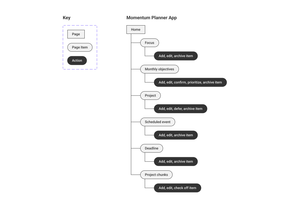
With the key features identified in order to build the app, the design team was able to map out user flows that would show how a user could navigate the app successfully from start (zero state) to finish (filled state). Based on the user flows, we were able to construct the sitemap to visualize what elements needed to be included in the MVP.
With the sitemap elements established, Nathan created wireframes to layout the elements that would appear on the page and represent the functionality of the app. We wanted to make sure that we captured all the items that needed to be displayed and organized it in a way that would make sense to users.
User interface design
Once the wireframes were approved by the client, I led the visual design process by exploring possible color palettes, fonts, and element styles that would work well with the Productive Flourishing brand. I gathered inspiration from the current company website and existing productivity app branding.
The goal of the interface was to keep the mobile app friendly, simple, and soothing for the user base. I accomplished this by using pastel colors, rounded corners, playful icons, and a sandy-colored background that resembled paper.
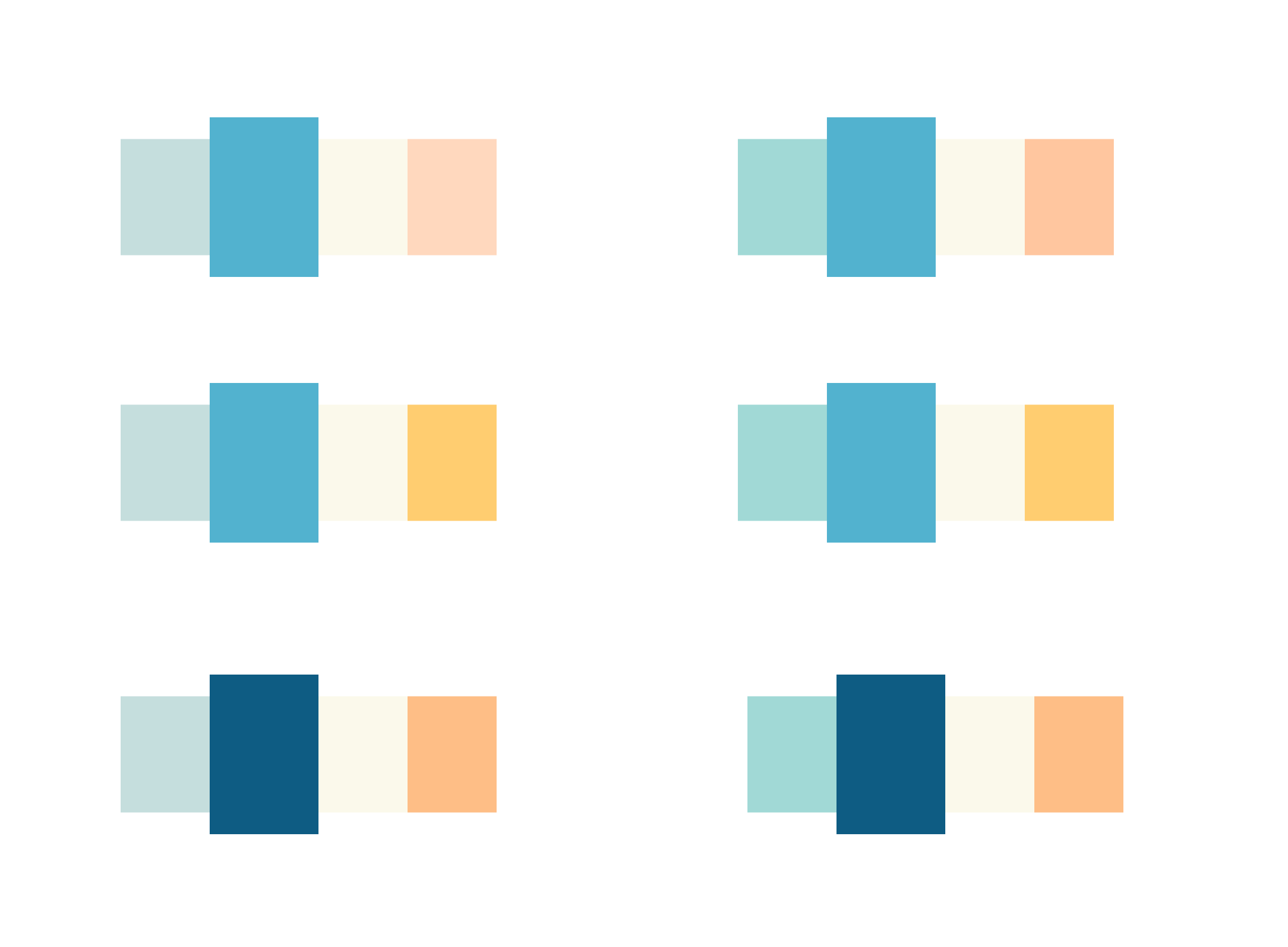
Early color palette explorations
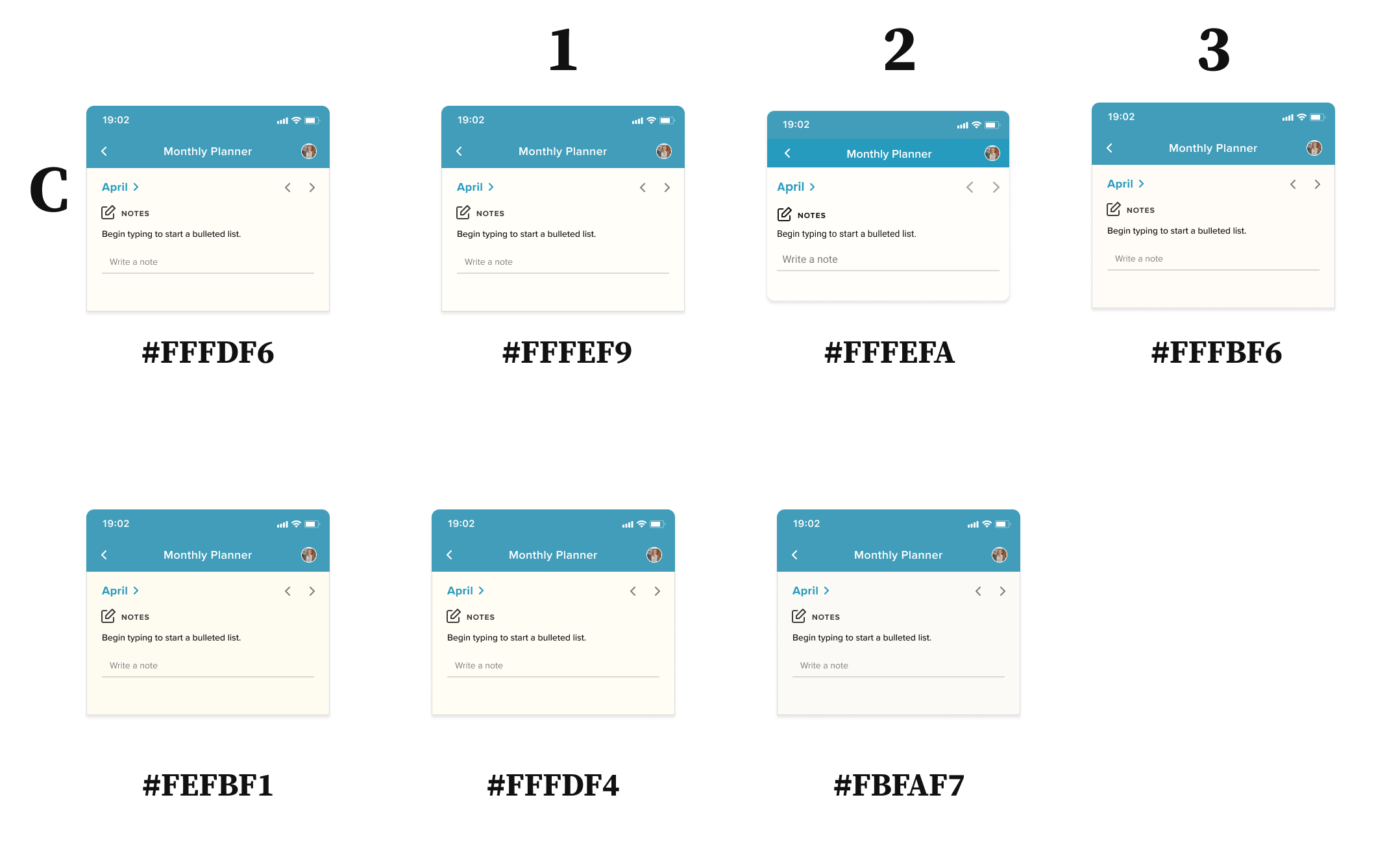
Mobile background explorations of a paper-like color
I presented my visual design explorations to the design team and client to gather feedback on my color palette, typography, and element styling choices. By conducting feedback sessions, I was able to ensure my visual branding stayed true to the company’s vision while staying accessible to the target users.
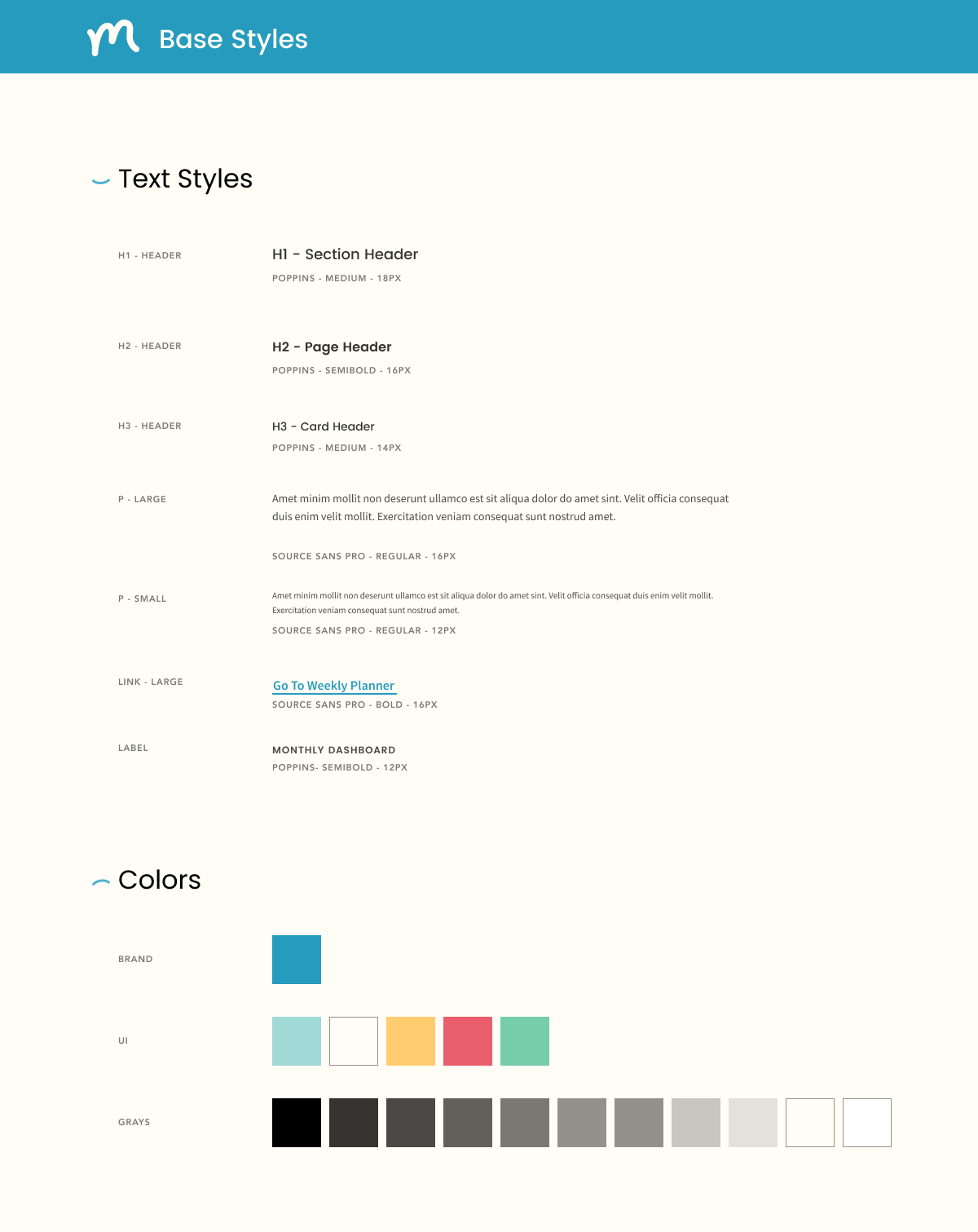
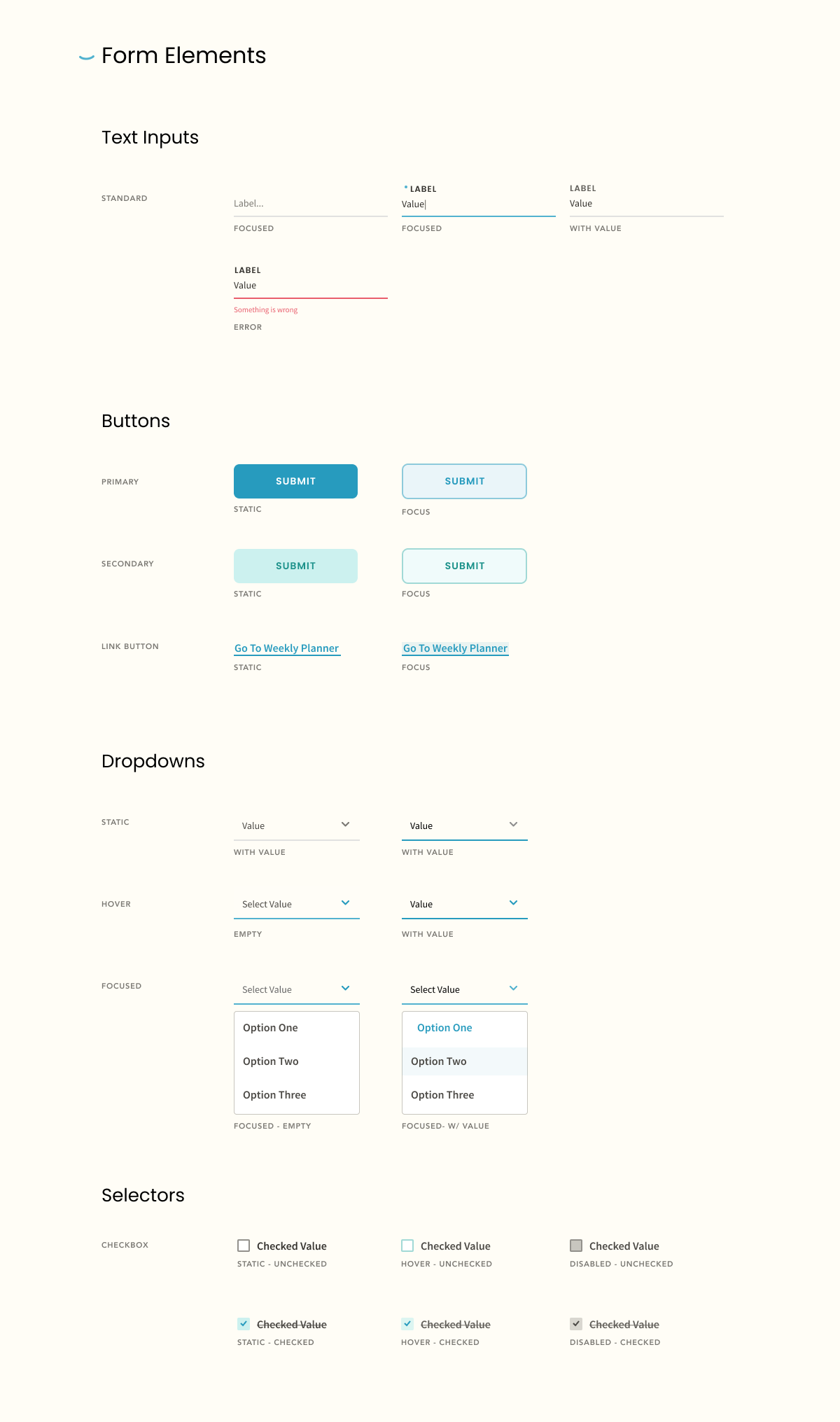
Once these visual elements were approved, I created a style guide that I could use and reference while designing the UI of the app.
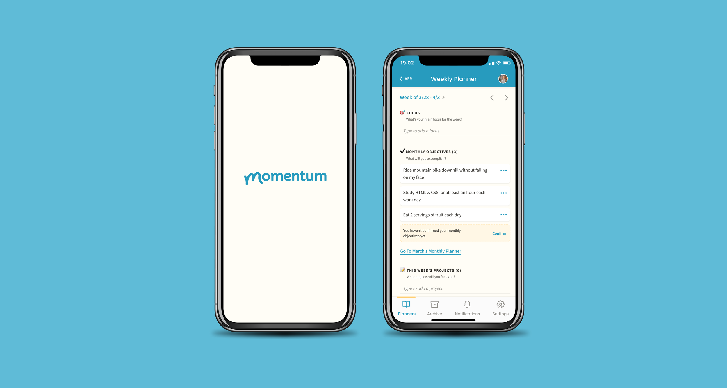
Final key screens
Weekly and monthly views:
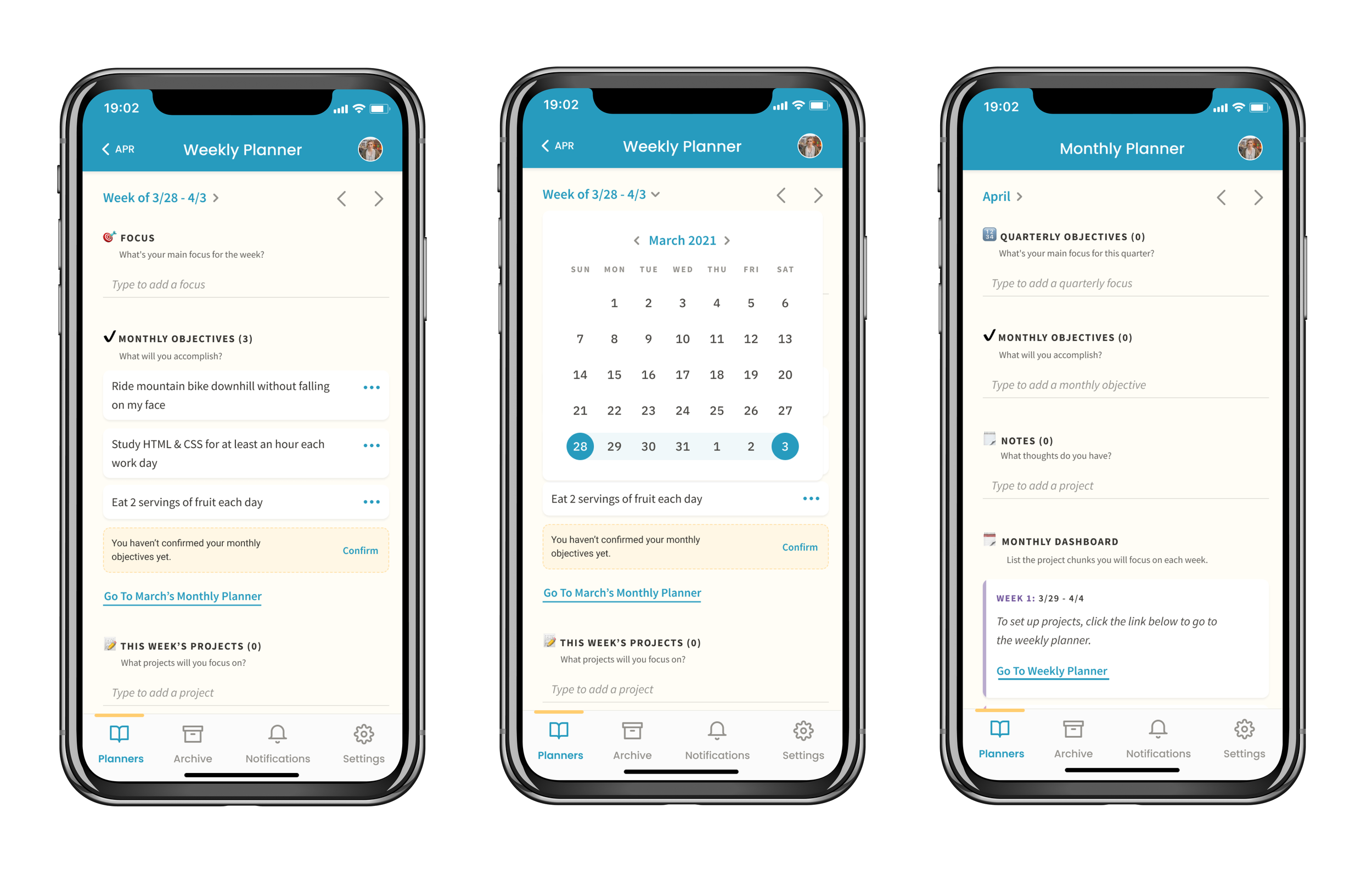
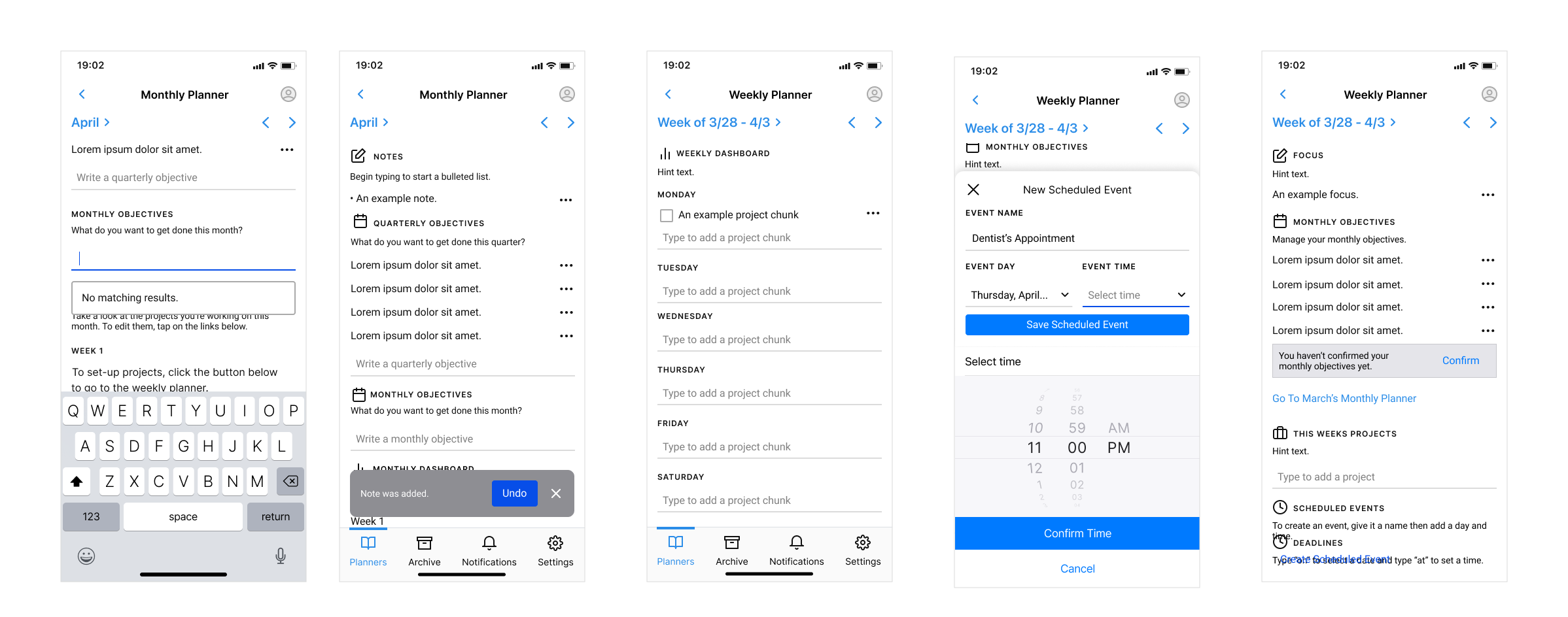
The user is able to navigate between weekly and monthly views by clicking on the month text link at the top bar to select a month, or they can select a specific week by clicking on the week text link below the top bar. Under monthly objectives, the user can also navigate from the weekly view to the monthly view.
Add focus:
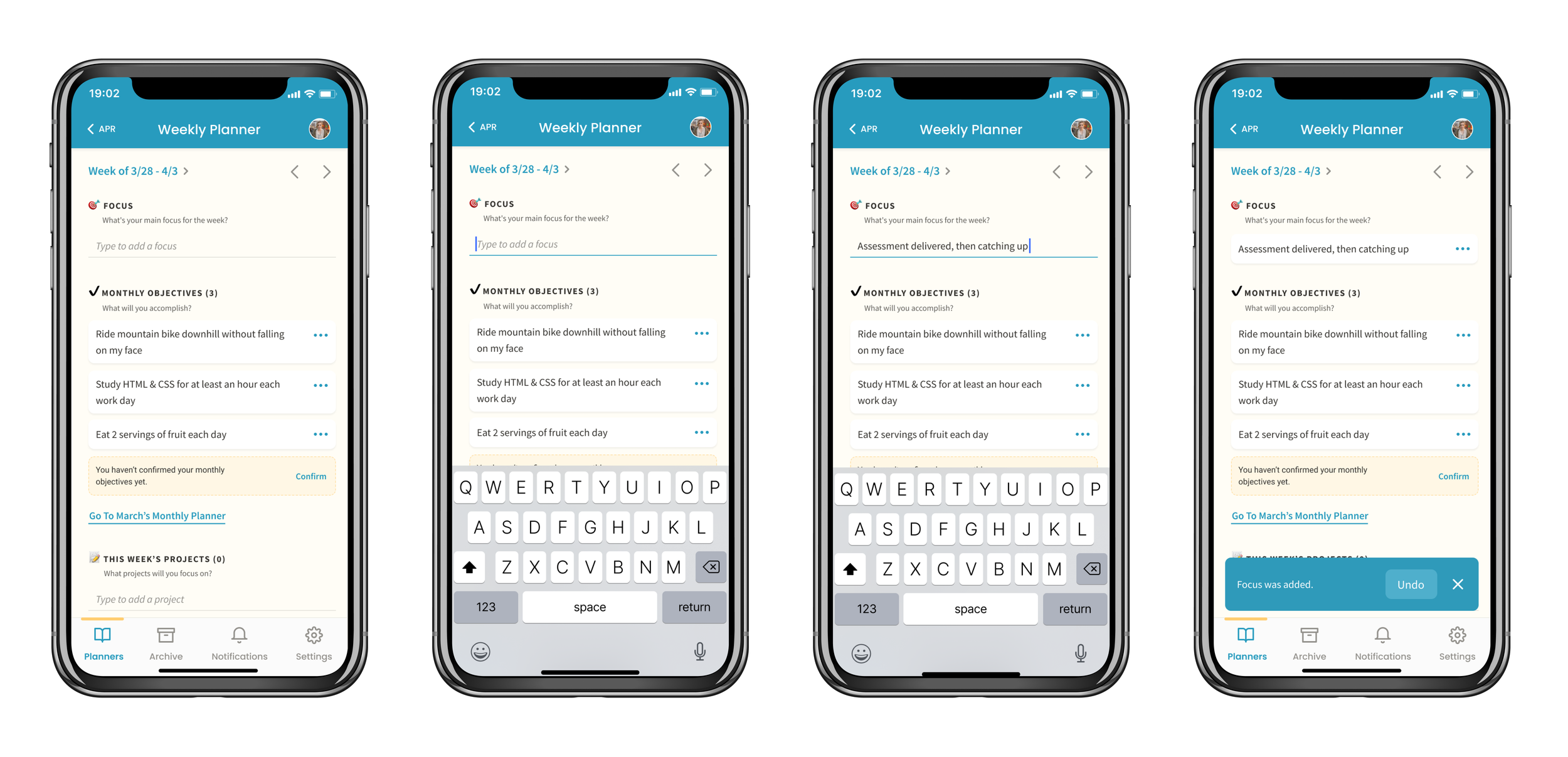
To add a focus item, the user can click into the space below the title “Focus”, and type a main focus they want to keep in mind for the week. Once it is added, the user can also edit or archive the item by clicking on the 3 dots located at the right on the card. This is the same method for adding, editing, and archiving monthly objectives, this week’s projects, and project chunks.
Add scheduled event:
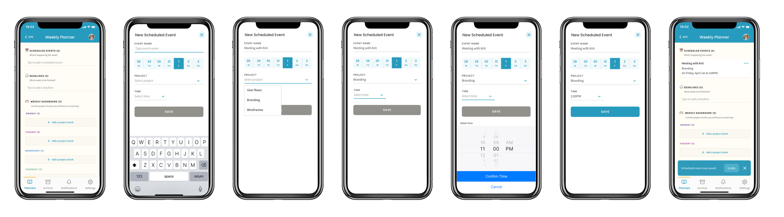
The method for adding scheduled events and deadlines is slightly different because it involves a selected date. To add a scheduled event, the user clicks into the space below the title, adds the event name, project name, and time. Then, the user can save the item and edit or archive it by clicking the 3 dots on the right side.
Bonus: customer delight
We had heard from customers and the client that customer delight, while optional, could be a great way to create a positive experience with the app. It got me thinking - one of the advantages of having a digital interface over a paper one is the ability to add animation. Users of the planner are encouraged to confirm their monthly objectives and complete their weekly project chunks - perhaps rewarding them with a simple animation for doing these tasks would bring delight. I added animations (from Lottie) for these moments to celebrate the user meeting their goals.
When monthly objectives are unconfirmed, a message is displayed that reminds the user to perform this action. Once clicked, the users see a green checkmark animation appear and then disappear, and the message is no longer shown.
Users are able to add daily project chunks that they complete over a week. When a user checks off the last item of the week as complete, a celebratory animation appears, and the tasks move to the “completed” section.
Outcome
The mobile prototype I created was shown for feedback within my design team and to the client, and I iterated as necessary to continue improving the design. Once the final prototype was approved, the client was able to show the demo to investors, and ultimately, use the prototype for raising funding on Kickstarter. The customers loved the simple, updated design, and the project was successfully funded with 445 backers.