

GreyNoise Intelligence
How we revamped the existing website to give security analysts more certainty
My Role: UI/UX Designer, Illustrator
Client: GreyNoise Intelligence
Team: Austin Price (Creative Director), Austin Carr (Engineer), Ronnie Villarini (Engineer), Bina Farooque (Project Manager)
Tools: Figma
Who is GreyNoise?
GreyNoise Intelligence is a cybersecurity company that wanted to effectively communicate their product and cybersecurity expertise to a growing number of new security & technology professionals that had started visiting their website. The company’s main product is a web app called the Visualizer, which allows users to explore a huge amount of security data throughout the world.
How it worked before
Due to GreyNoise getting more press, the site was receiving more and more new visitors. However, because the homepage was just a screen with a large search bar, many visitors were getting confused and unable to easily navigate the website to learn more about the product.
The Visualizer was the key product of the company, so how do we redesign their website to still feature the Visualizer prominently, but also help new visitors navigate the space?
Understanding user problems
Our first step was to empathize and understand the GreyNoise user needs so that we can define the pain points they are facing and explore solutions.
By speaking with the GreyNoise stakeholders and their users, we identified 3 key areas where the website could be improved:
1. Website navigation uncertainty: The homepage does not allow for easy navigation for new users to find the information if they are unfamiliar with the website - it features the Visualizer search bar but new users don’t know how to use it.
2. Product & company uncertainty: The homepage features a navigation menu, the company logo, and the Visualizer search bar, but doesn’t provide information about what the Visualizer is capable of doing. There is also no page dedicated for company updates or posts for customers to stay updated with what the company is up to.
3. Service package uncertainty: The homepage but doesn’t have a page where users can see the different pricing models that the company offers - they would have to contact the GreyNoise team directly for that information.
How do we improve the navigation menu?
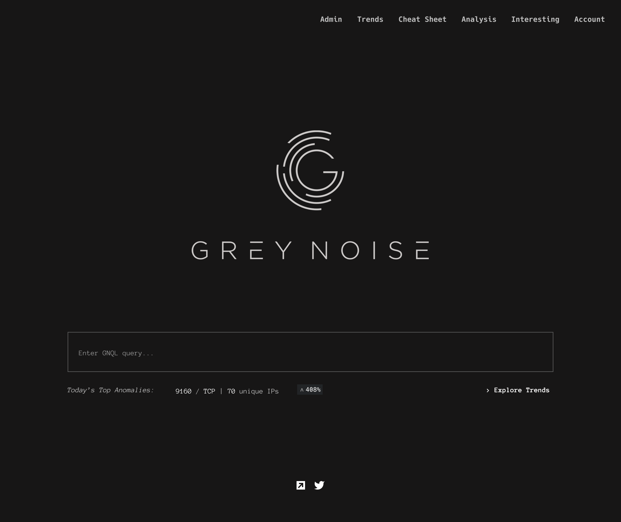
Homepage from before
It became clear to me that we would need to redesign the navigation first as it was lacking clarity. I organized the new pages we would add to the existing site to build a navigation structure that allowed me to visualize how the pages were related and how a user could navigate from one page to another.
Navigation structure - click on image to enlarge
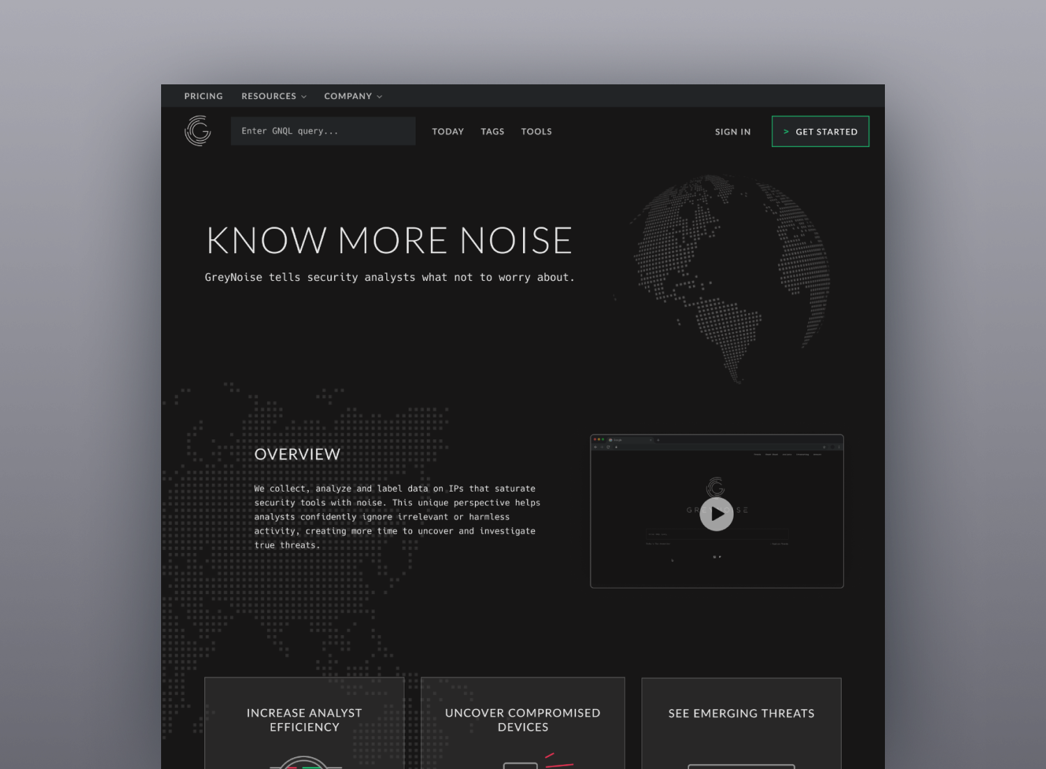
After creating the navigation structure, I made a sitemap to show what information would be displayed on each new page. This helped with organizing and sorting the new content. The Visualizer would still be accessible on the homepage, but now the homepage would now also contain an overview of the company, top 3 use cases, how the product works, 2 paragraphs about its feature highlights, and a list of third-party integrations.
Sitemap - click on image to enlarge
Creating a number of possible solutions
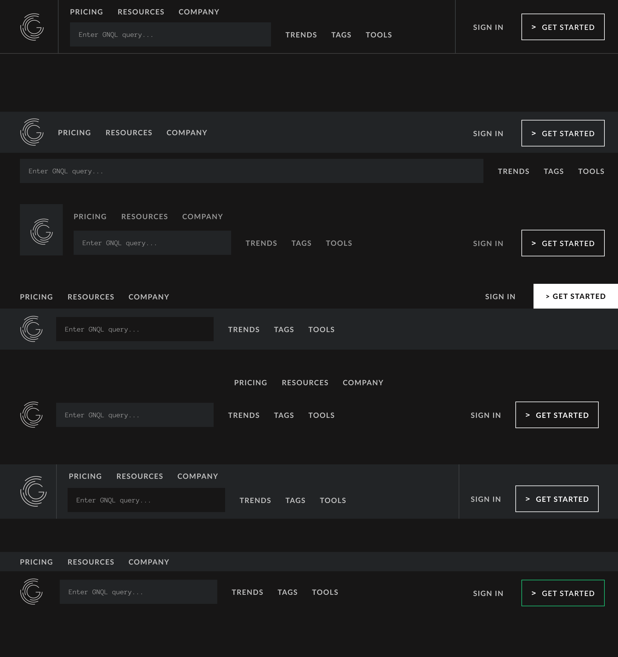
I started creating the navigation menu with 2 rows of text links in mind. The first row would allow users to click on Pricing, Resources, and Company text links to learn more about what GreyNoise offers. The second row would be where the Visualizer search bar would live, with the Trends, Tags, and Tools text links to the right of the search bar. In the old design, there was an Explore Trends text link below the search bar, but to access Tags and Tools, the user had to find them through the Cheat Sheet link on the top navigation menu. Now, all 3 of these items are next to each other for easy access.
Since I still needed to place the Sign In and Get Started links somewhere at the top of the page, I experimented with a couple ways to fit all these links together, settling on placing the Sign In and Get Started links to the right of the Visualizer search bar. Now that the Visualizer search bar had Trends, Tags, and Tools links to the right of it, as well as the Sign In and Get Started links, it was no longer able to stretch as long across the entire page as it once did. However, since users might want to run a long query, they would need more room than what was currently shown in the search bar. My solution was to expand the search bar when the user clicked on it - in this active state, popular query options would be shown as well as the search button. If the search bar was clicked again, it would condense to its inactive state again.
Final desktop navigation menu design:
After submitting the navigation menu design for both internal and external review, I received feedback that the Get Started button with the white outline was not prominent enough at the top of the page. In response, I changed the button outline color from white to green to make it stand out more.
Mobile navigation menu design:
As we needed to optimize the new website for mobile devices as well, I created a mobile version of the navigation menu. At first, the Visualizer search bar was only visible when a user clicked on the menu icon to open a new page, but after meeting with the engineering team, we decided it would be best to show the search bar directly on the homepage as hiding it may confuse users. Due to the mobile design having less screen space, the text links are not visible on the homepage and are accessed from the menu instead.
Homepage
User problem: I don’t know what GreyNoise is and what their product does.
Our solution: Create 3 illustrations at the top of the page that described what GreyNoise can do, customer testimonials that users could click through, and a “logo conveyor belt” that display some of GreyNoise’s 3rd party integrations.
Pricing
User problem: How do I know how much this product costs, and which package I should choose for me (or my team) if I am interested in it?
Our solution: Add a pricing model page with 4 different options to allow users to choose a package that works best for them or their security team. The price shows what features are available on each package, and also displays information for VIP, Reseller, OEM, or Technology partner access below the pricing model.
Blog
User problem: Where can I go to see what GreyNoise is up to?
Our solution: Create blog page that users can access from the homepage. The blog page will have a “Featured Post” section at the top of the page, with the rest of the posts stacked vertically underneath. Each post contains tags that show the user what topics are relevant. Clicking into a specific post, users are able to share the post through Twitter or LinkedIn.
Launch! (and results)
Once the designs were presented for internal & external feedback and received approval by both teams, I worked closely with my engineers for handoff. I made sure the graphic assets were exported as SVG files and optimized all the new screens for mobile devices.
The new website was launched just in time for the company’s first Open Forum for existing and new users to attend. While my team didn’t have direct access to GreyNoise’s users to see the results, the feedback we heard from the GreyNoise team was overwhelmingly positive. Users found the new design slick and appealing with an improved navigation menu. The GreyNoise team is now able to alert their users of new product features through their blog posts, sharing these links through the company Twitter and LinkedIn pages.