Data Visualization Process for Scope Dashboard
Glossary:
Event: Any web request or authentication attempt
Anomaly: An abnormal event that starts an investigation
Investigation: When 1 or more anomalies occur and generates an incident
Escalation: An abnormal incident that is high urgency and needs attention
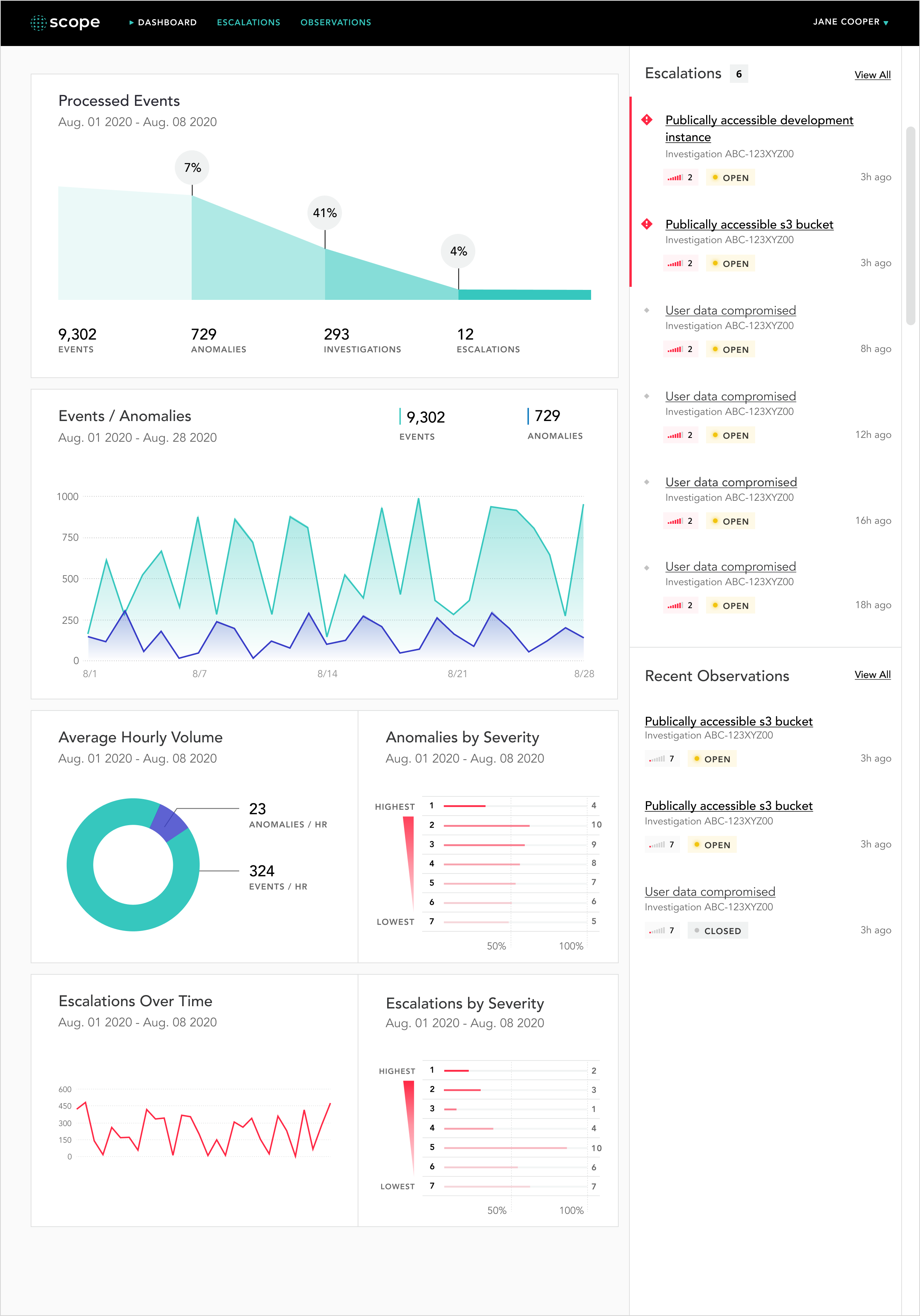
In total, the client had 6 different data sets to show:
1) Processed Events - Displays the percentage of events that are anomalies, investigations, and escalations over a time period (monthly, quarterly, annually, all-time)
Note: For v1 of this product, the design defaults to all-time
2) Events/Anomalies - Shows the number of anomalies compared to the number of total events
3) Average Hourly Volume - Shows the amount of anomalies and events that occur per hour over a time period
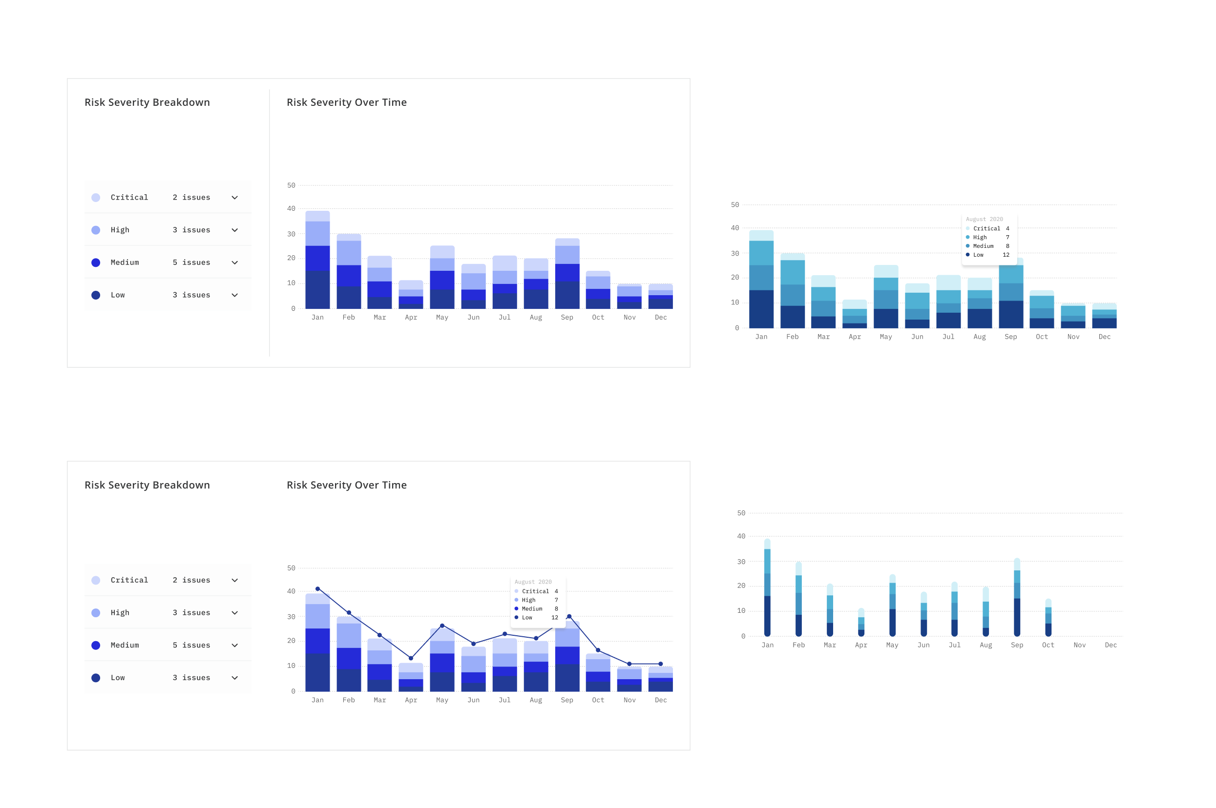
4) Anomalies by Severity - Shows the amount of low and high severity anomalies
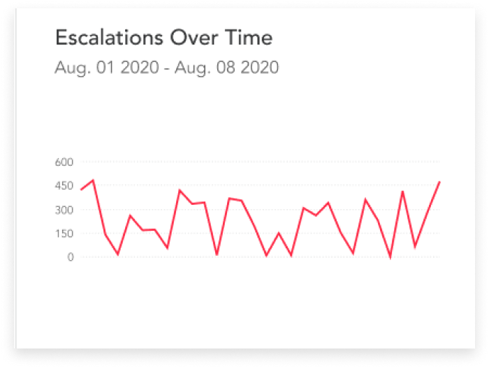
5) Escalations Over Time - Shows amount of escalations
6) Escalations by Severity - Shows the amount of low and high severity escalations
To begin the data visualization design process, I had to first research data types and data visualization graph types. I wanted to ensure that the graph types I chose to represent the data made sense and were easy to read. In addition, I limited the number of colors used for each graph as I wanted the user to focus on what is important (anomalies & escalations).
Processed Events:
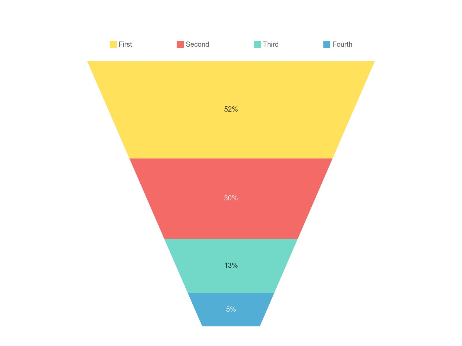
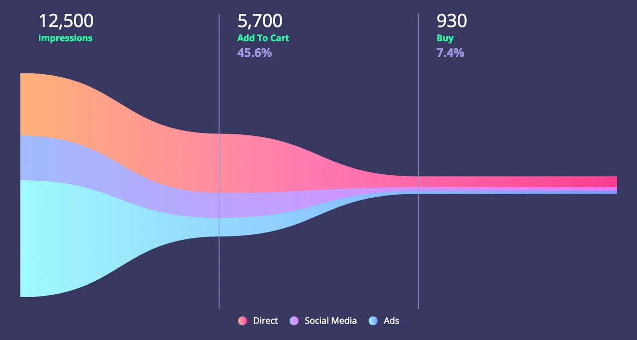
For processed events, I chose to experiment with several funnel chart types as the data shows values across multiple stages in a process. I looked at existing examples of funnel charts for inspiration and reference.
Existing funnel chart examples:
While the funnel chart worked well to display this type of data, the chart required quite a bit of vertical real estate and I had 5 other data sets I needed to show on this page. To solve this potential issue, I chose to make the funnel chart horizontal to allow the other data sets to fit on to one page.
Early Explorations of Processed Events Graph:
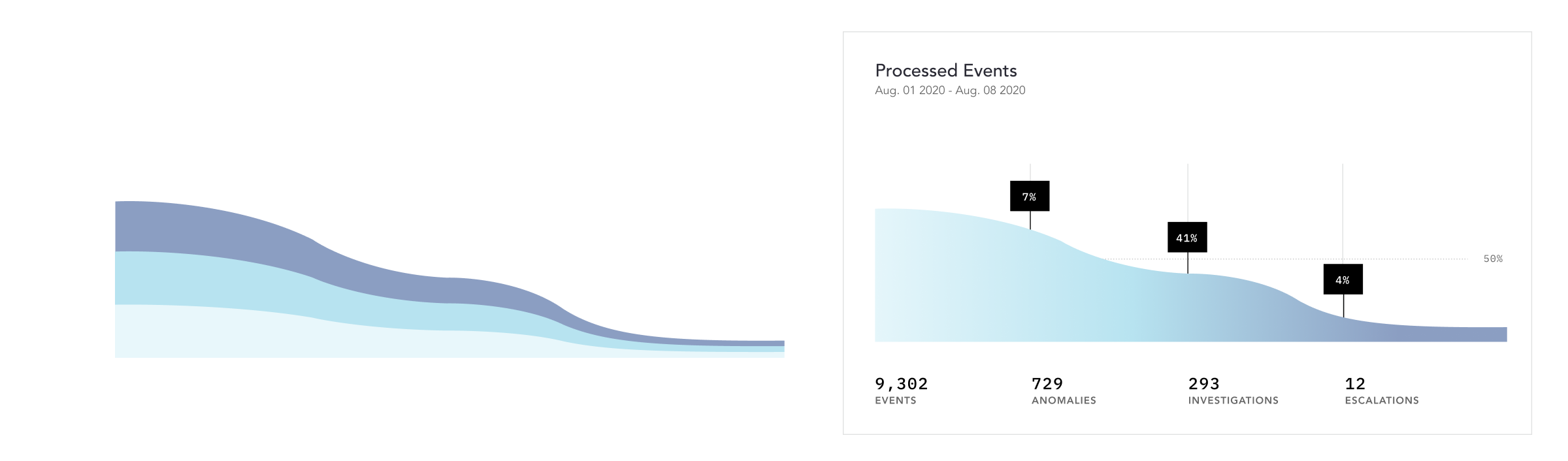
Final Design:
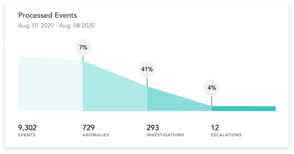
After multiple explorations of the funnel chart and rounds of both internal and external feedback, the design shown above is what we used for the final design of the dashboard. The design displays the percentage of events that become anomalies, the percentage of anomalies that become investigations, and the percentage of investigations that lead to escalations in a more and more saturated teal color as it progresses from left to right.
Events/Anomalies:
For Events/Anomalies, I had 2 sets of data over the same time period and needed to show how they compared to each other. I experimented with double bar and line graphs, and ended up choosing the double line graph since a line graph is better suited for showing data over long periods of time as the nature of a line allows it to bend and display change with more visual detail.
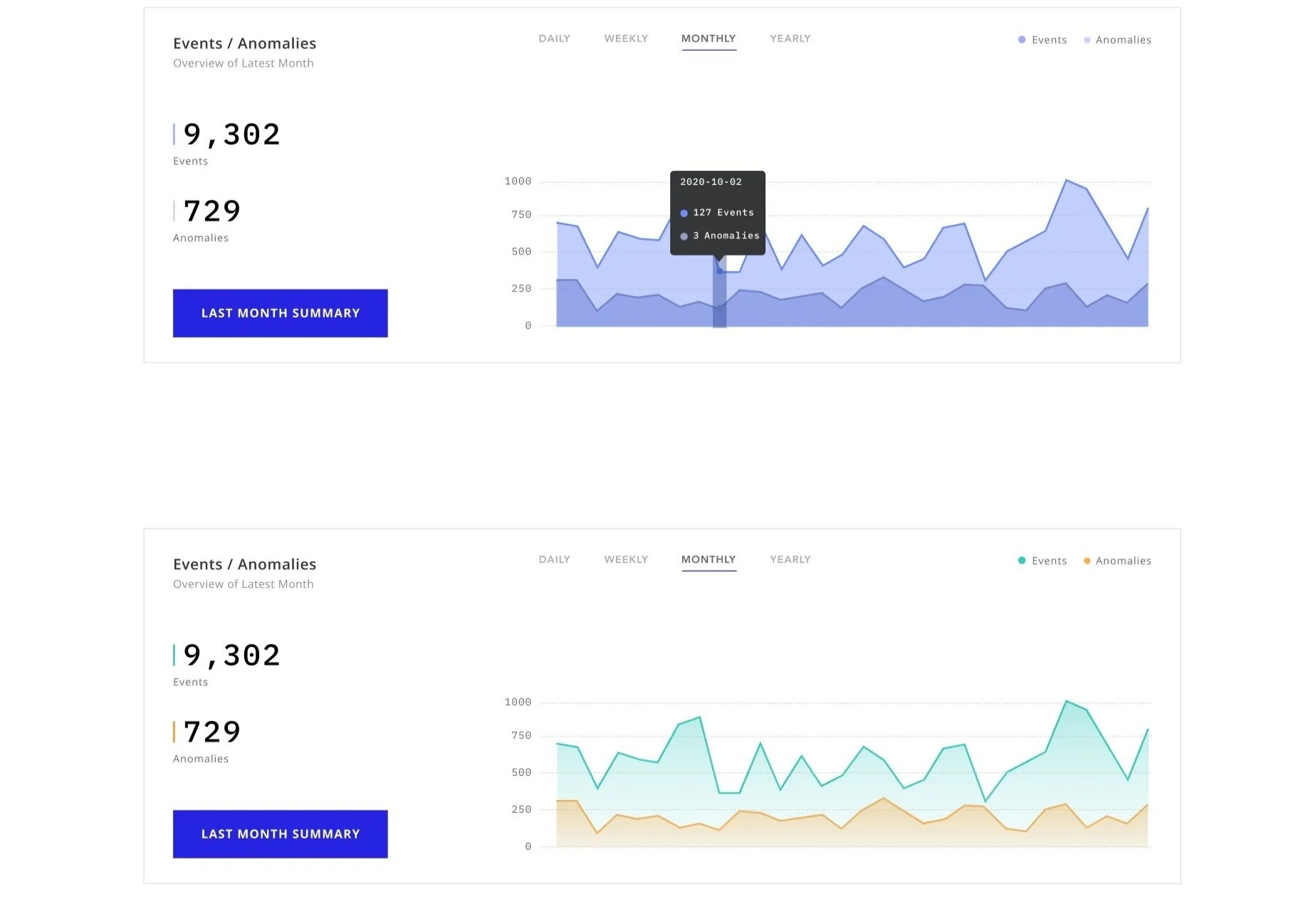
Final Events/Anomalies Graph:
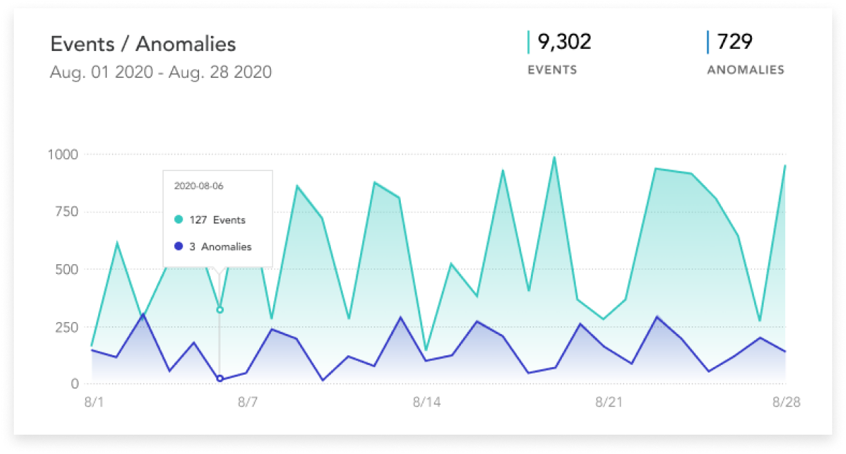
The final version of the Events/Anomalies graph consists of double lines and allows the user to use their mouse to hover over dates. On hover, a modal will pop up that displays the number of events and anomalies specific to that day.
Average Hourly Volume:
For Average Hourly Volume, I chose a donut chart as I wanted to show the portion of anomalies as a percentage over the total number of events. There wasn’t much of a change from my first Average Hourly Volume donut chart to the final version - just color changes. I chose to stick with the teal and blue color to match the rest of the graphs.
Final Average Hourly Volume Pie Graph:
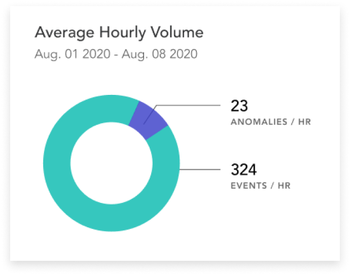
The final design displays the events per hour in teal and the number of anomalies per hour in blue with number markers.
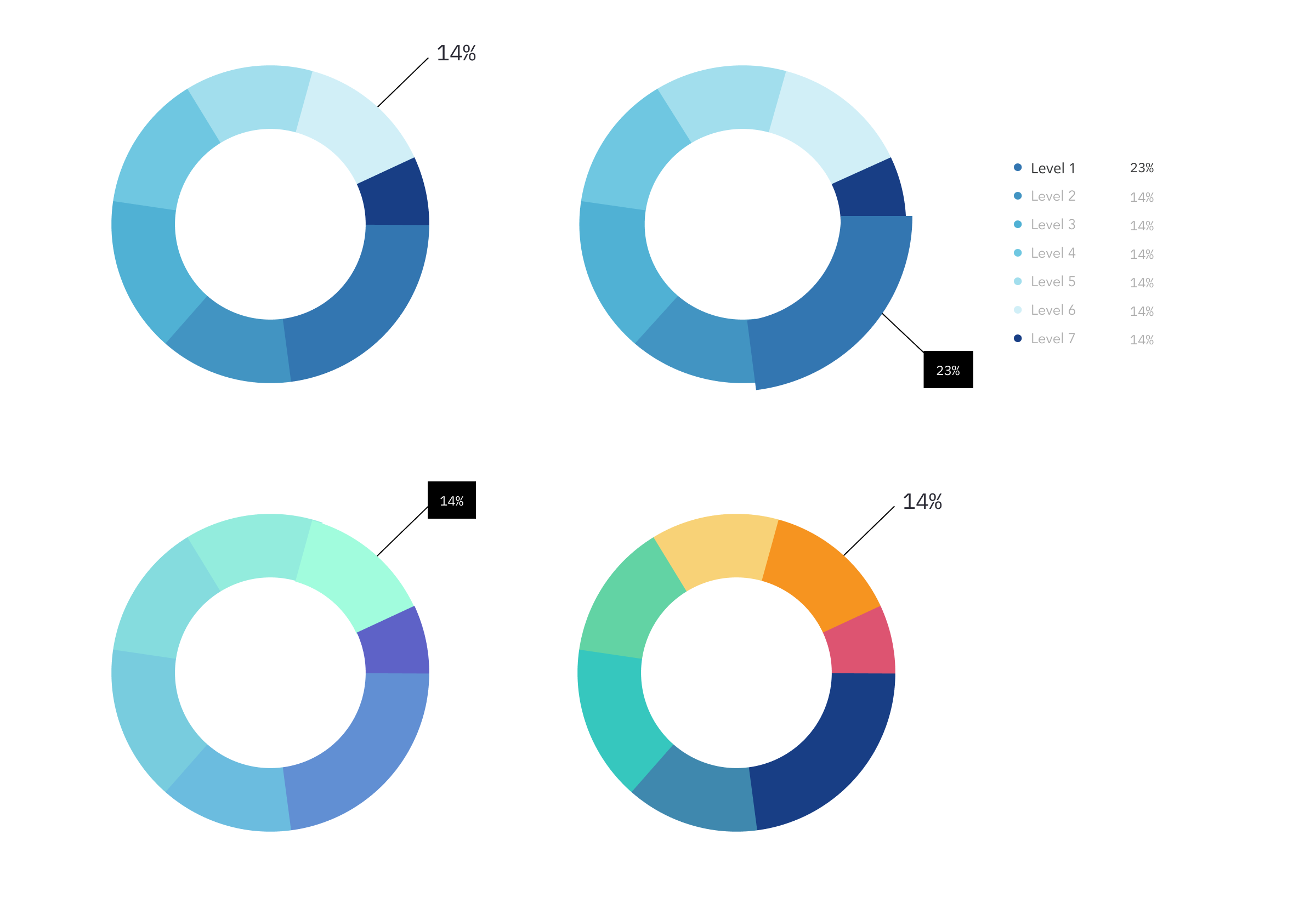
Anomalies By Severity & Escalations By Severity:
Both of these sets measure the number of items within a time period that are abnormal. Because they’re both representing similar data, I chose to use the same graph type for them. I experimented with representing the data with donut charts and radar diagrams, but felt the data wasn’t easy to parse in these designs.
Final Anomalies & Escalations By Severity Graphs:
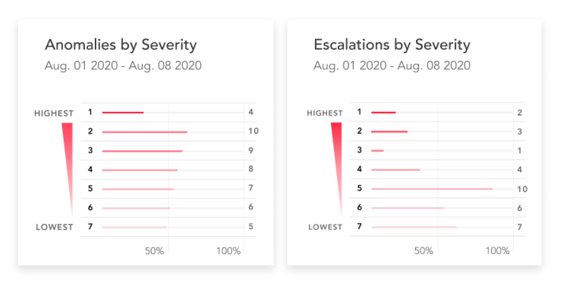
In the end, I created a horizontal bar chart with a severity indicator on the left side. I chose to go with a horizontal bar chart rather than a vertical one because labels are easier to display in this format. A severity level 1 is the most severe level, while level 7 is the lowest severe level. The red color in the chart becomes more saturated as the severity level increases.
Escalations Over Time
For Escalations Over Time, I used a line graph to show the trend over time, and chose the color red for the line to indicate its highest severity status to the user. This was the easiest graph to create out of all the other data sets. I knew I had to display information as a series of data points within a time period, and a line graph was an effective way to represent this data in an easily digestible way.